Welcome to out first session on Spatial data analysis! By the end of this session, you will:
Code
library(needs)needs(sf, # for handling geometries, osmdata, # for adding elements from the OpenStreetMap database, tidyr, ggplot2, giscoR, # for Eurostat administrative information, haven, dplyr, geodata, # for data on climate, purrr, htmlwidgets, janitor # for text cleaning )
Understand what spatial (geographic) data are and why we should consider spatial data in the social sciences
Learn R’s sf package for storing and manipulating spatial vector data
Load and inspect spatial data formats (e.g., Shapefiles, GeoJSON)
Understand and apply coordinate reference systems (CRS) and projections
Perform basic geometric operations on vector data
Create basic spatial visualizations
Learn how to enrich spatial data with information from web‐based platforms.
Discuss the challenges of using location as a proxy for social phenomena.
Create advanced map visualizations in R.
Spatial thinking in the Social Sciences
There has been a steady growth of interest in spatial concepts and techniques within the social sciences. Much of this work builds on foundational research by geographers, but what distinguishes sociology (and related fields) is the application of spatial data, measures, and models to a wide range of substantive questions drawn from established intellectual traditions. Sociologists are less interested in spatial patterns for their own sake and more concerned with how those patterns reflect and shape social relations (Logan 2012).
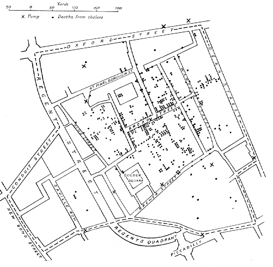
Original map made by John Snow in 1854. Cholera cases are highlighted in black, showing the clusters of cholera cases (indicated by stacked rectangles) in the London epidemic of 1854. The map was created in order to better understand the pattern of cholera spread in the 1854 Broad Street cholera outbreak, which Snow would use as an example of how cholera spread via the fecal-oral route through water systems as opposed to the miasma theory of disease spread. The contaminated pump is located at the intersection of Broad Street and Cambridge Street (now Lexington Street), running into Little Windmill Street. The map marks an important part of the development of epidemiology as a field, and of disease mapping as a whole.(Snow 1855)
Spatial data allow us to analyze how social processes—such as inequality, crime, or human behavior -— vary across geographic contexts. By explicitly incorporating location, we can uncover patterns and relationships that non -‐ spatial methods miss. As Abbott argues, “one cannot understand social life without understanding the arrangements of particular social actors in particular social times and places… Social facts are located” (Abbott 1997, 1152).
In spatial thinking we focus on four core concepts:
Distance: How far apart phenomena are in geographic space.
Proximity: The relative closeness of observations to one another or to key features.
Exposure: The degree to which a population encounters an environmental or social hazard.
Access: The ability to reach services, resources, or opportunities based on location.
All of these concepts depend on the underlying geometry of our data and our definition of space (Logan 2012).
Spatial thinking encompasses:
The arrangement of social phenomena in space (points, polygons, networks).
The causes of those locational patterns (e.g., economic forces, policy decisions).
The consequences for individuals and groups (e.g., unequal access, segregation).
Even when we work with areal units (neighborhoods, districts), we must grapple with questions of boundary definition and scale—issues that are substantive, not merely technical.
Incorporating spatial information to our models enables us to examine disparities in resource distributions, service accessibility, and with that information on opportunities and restrictions of individuals. This is critical for understanding and advocating for spatial justice and equity, as well as deriving (functioning) urban policies, that can lead and inform effective interventions on urban safety strategies, crime prevention or equitable resource allocation.
These last weeks we asked: Who is connected to whom, and how do these structures influence relationships and individual opinions, behavior and attitudes? Starting from this week, we ask ourselves: Who is close to whom - and what does this mean?
Spatial thinking is strongly based on the idea that:
“Everything is related to everything else, but near things are more related than distant things.” (First law of geography - (Tobler 1970))
It thus refers to reasoning about location, distance, and spatial relationships and can for example be useful in answering questions such as:
Are healthcare facilities equally accessible to all neighborhoods?
Is crime concentrated in specific urban areas due to overlapping social conditions?
Do voting patterns show spatial clustering due to shared environments?
What is Spatial Data?
Spatial data is any data that has a geographical attribute. It contains information about the location and/or shape of physical features on earth and can include much more than just the coordinates on a standard dateset (Pebesma and Bivand 2023).
For example: A dataset on schools might contain school names, addresses, and exact coordinates (latitude/longitude) — allowing us to map them.
Spatial data is often unstructured:
Formats vary (Shapefiles, GeoJSON, GPKG, KML)
Coordinate systems may be missing or mismatched
Boundaries and resolutions differ across datasets
Files may contain only geometry but no relevant attributes
Thus data must be cleaned, projected and joined to be useful for further analysis.
Coordinate Reference Systems
Spatial data is data characterized by coordinates in a coordinate system. Different coordinate systems can be used for this, and the most important difference is whether coordinates are defined over a 2 dimensional or 3 dimensional space referenced to orthogonal axes (Cartesian coordinates), or using distance and directions (polar coordinates, spherical and ellipsoidal coordinates).
A Coordinate Reference System is a framework used to uniquely define spatial positions on Earth. It acts as the interface between the coordinates of a geographic object and its real-world location.
A CRS consists of two main concepts:
Coordinate system: A set of mathematical rules that specify how coordinates are assigned to points
Datum: Parameters that define the origin, scale and orientation of the coordinate system.
a geodetic datum is a datum that describes the relationship of a two- or three-dimensional coordinate system to the Earth
We use different datums, because the earths shape is irregular. The geoid — the surface of constant gravitational potential approximating mean sea level — is not a perfect sphere or ellipsoid. To approximate the geoid, ellipsoids of revolution (ellipsoids with two identical minor axes) are used.
Fitting an ellipsoid to the Earth’s surface results in a datum. Different datums arise because ellipsoids can be fit globally (e.g.: WGS84 (World Geodetic System 1984), used worldwide by GPS.) or locally (g.e.: ETRS89 (European Terrestrial Reference System 1989), fixed to the European tectonic plate), resulting in varying levels of accuracy for different regions.
A projection converts geographical coordingates (longitude, latitude) into planar cartesian coordinates (X,Y). Since it is impossible to provide an exact representation of a curved surface on a plane, specialized projections were developed for different regions of the world and different analytical applications.
For example, the images below show how identical circular areas appear at different points of the Earth under a Mercator projection (which preserves shapes), a Lambert equal-area projection (which preserves areas) and a Mollweide projection (preserving area proportions but distorting shape).
Mercator projection: preserves angles, distorts size near poles
Lambert projection: area-preserving, useful for mid-latitudes
Mollweide projection: compromises shape and area, good for global maps
You can find a list of (in R) implemented projections using sf::sf_proj_info(type = "proj").
Most tools for spatial analysis (including R-spatial packages) use PROJ, an open source C++ library that transforms coordinates from one CRS to another. They can be described in many ways including formalized “proj4 strings” such as +proj=longlat or identifying authority codes like EPSG-codes. The latter is more modern and the corresponding codes can be found on this website
GIS
Geographic Information systems were originally developed in the 1960s-90s as a standalone software to manage spatial data. Today, spatial data tools are more and more integrated into data science languages like R and Python - bringing spatial data analysis into reproducible workflows.
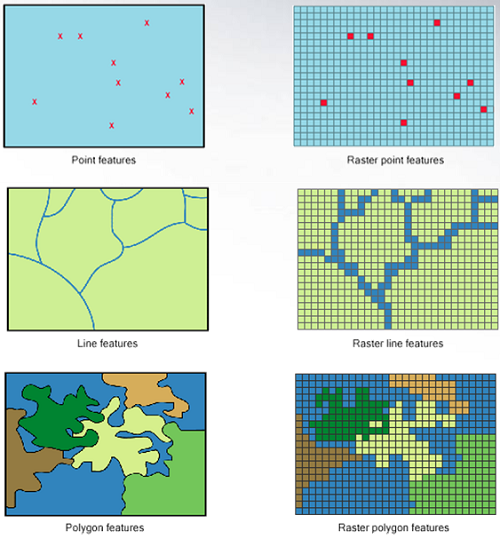
Types of spatial data
In GIS, spatial data is typically represented in one of two formats (Moraga 2024).
While vector formats are great for discrete features, raster format can be more useful for the representation of continuous variables.
Vector data formats
Shapefile (.shp): legacy format, often comes with .dbf, .shx, etc.
GeoJSON (.json): used in web mapping, lightweight, human-readable.
Geopackage (.gpkg): modern format; compact, supports multiple layers in one file.
KML/KMZ: used by Google Earth.
Raster data formats
TIFF (.tif): supports georeferencing and multi-band data; widely used.
NetCDF (.nc): used in climate science and geosciences.
Other image files — JPEG, PNG (used rarely in analysis but common for display)
If needed we can also transform vector data to raster data and vice versa.
For this lecture (and usually when using spatial data for the social sciences) we will focus on vector representation of data.
Raster data:
Representation of geography as a continous of pixels (gridcells) with associated values. They normally represent high resolution features of the geograpy (like an image)
Vector data:
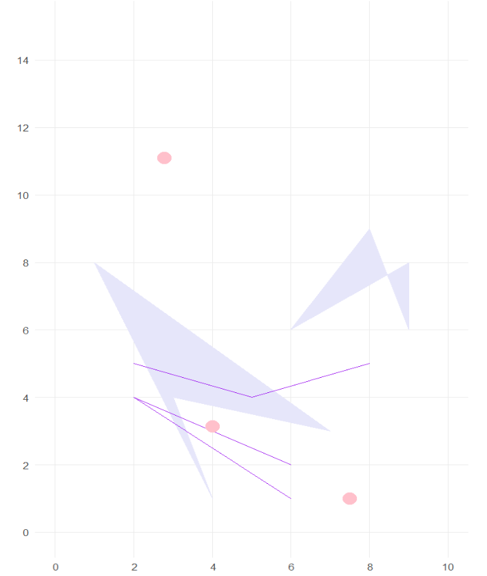
All geospatial vector data can be described by a set of geometric objects (so called simple features.)
The most common spatial types are points, lines and polygons:
Geometric Entity
Description
R
Example
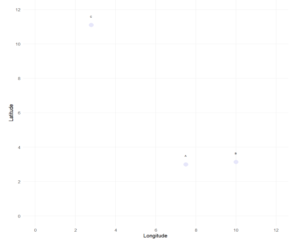
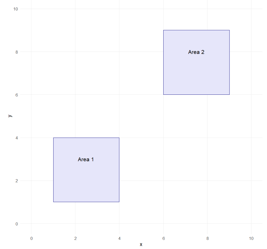
Points
Discrete locations in space defined by a single pair of coordinates.
st_point(c(2, 3))
Location of survey respondents, cities, bus stops
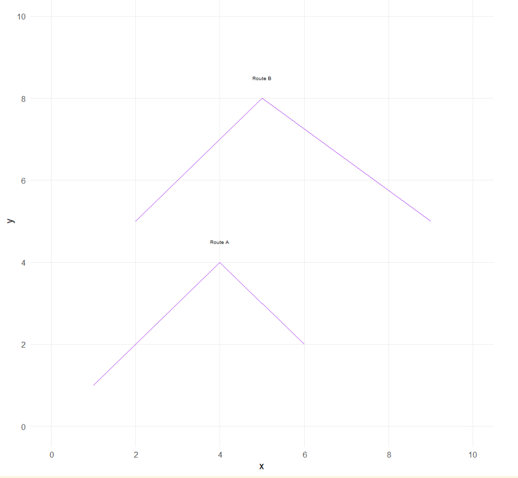
Lines
Ordered sequences of points connected by straight segments.
st_linestring(rbind(c(1, 2), c(3, 4), c(5, 6)))
Roads, rivers, subway lines
Polygons
Closed sequences of points defining areas; first and last points must be the same.
A feature is thought of as a thing, or an object in the real world, such as a building or a tree. As is the case with objects, they often consist of other objects. This is the case with features too: a set of features can form a single feature. A forest stand can be a feature, a forest can be a feature, a city can be a feature. A satellite image pixel can be a feature, a complete image can be a feature too.
Features have a geometry describing where on Earth the feature is located, and they have attributes, which describe other properties. The geometry of a tree can be the delineation of its crown, of its stem, or the point indicating its center. Other properties may include its height, color, diameter at breast height at a particular date, and so on.
https://cran.r-project.org/web/packages/sf/index.html is the state of the art package for working with spatial vector data in R. It replaces older packages (that are still available like spand rgdal) with a clean, modern interface that aligns with the tidyverse(Pebesma n.d.).
Every spatial object in sf contains:
Geometry (shapes/coordinates)
Coordinate Reference System (CRS/projection)
Attributes (data about the object)
The most common geometry types supported by the sf package are:
Type
Description
POINT
Zero-dimensional geometry containing a single coordinate (e.g., a tree)
LINESTRING
One-dimensional sequence of points forming a path (e.g., a road or river)
POLYGON
Two-dimensional area enclosed by lines (e.g., a building footprint)
MULTIPOINT
Set of points (e.g., tree locations in a park)
MULTILINESTRING
Set of lines (e.g., transit routes in a city)
MULTIPOLYGON
Set of polygons (e.g., a country with multiple islands)
GEOMETRYCOLLECTION
Mixed set of geometry types (e.g., points, lines, polygons combined)
We can also define empty geometries (placeholders) for spatial objects. It is similar to having an NA in a column of a data frame. This is useful to preserve data structure consistency, even if some lack location. We can check st_is_empty() to filter or check for empty geometries before performing operations.
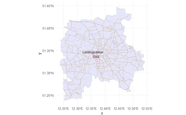
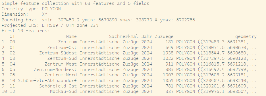
# Load Leipzig Polygon (with Stadtviertel) from Shapefileleipzig <- sf::st_read(dsn ="Data/Leipzig/ot.shp") # dsn = Data Set Name, leipzig
We can define strings, lines or polygons like above, using st_point(), st_linestring() or st_polygon().
line <-st_sf(name ="Connection",geometry =st_sfc(st_linestring(rbind(st_coordinates(doeni),st_coordinates(gwz) )),crs =4326 ))# Plot everythingggplot() +geom_sf(data = leipzig, fill ="lavender", color ="lightgray") +geom_sf(data = leipzig_streets, color ="bisque3", size =0.3) +geom_sf(data = doeni, color ="pink", size =3) +geom_sf_text(data = doeni, aes(label = name), nudge_y =0.005, size =3) +geom_sf(data = gwz, color ="pink", size =3) +geom_sf_text(data = gwz, aes(label = name), nudge_y =0.005, size =3) +geom_sf(data = line, color ="lightblue", size =1) +theme_minimal()
Added Linestring between my work and my favorite Döner
Geometric confirmation
# Check if geometries are valid - meaning following the formal rulesst_is_valid(leipzig_streets)# Check geometry typest_geometry_type(leipzig_streets)# Check if geometry is emptyst_is_empty(doeni)# Get CRSst_crs(leipzig)st_crs(doeni)# Ceck if point lies inside polygonst_contains(leipzig, doeni)
Geometric operations
# Buffer: create a buffer zone around a point (e.g., 500 meters)doeni_buffer <-st_buffer(doeni, dist =500, 4326) # approx 500m in degrees (~very rough!)# Intersection: streets intersecting with the bufferstreets_near_doeni <-st_intersection(leipzig_streets, doeni_buffer) |>select(osm_id, name, geometry)# Difference: parts of streets outside bufferstreets_outside <-st_difference(leipzig_streets, doeni_buffer) |>select(osm_id, name, geometry)
We can check all methods for sf- objects with methods(class = "sf")
Add data to simple features
Even though these plots already look pretty cool, we as sociologists are usually interested not just in looking at the placement of objects, but more on how these relate to further variables. The sf handles data like a data.frame, allowing us to combine it (and add) further data to the frames and thus analyzing the relations between different phenomena.
Imagine if we were interested in analyzing whether the movement of actors in Leipzig is dependent on my Lieblingsdöner. For a descriptive (and visual analysis) we load, clean and add data on the innercity movements of Leipzig.
raw <-read.csv("Data/Leipzig/Bevölkerungsbewegung_Wanderungen.csv")names(raw)unique(raw$Sachmerkmal)zuzuege_innerstaedtisch_2024 <- raw |>filter(Sachmerkmal =="Innerstädtische Zuzüge") |>pivot_longer(cols = X2015:X2024,names_to ="Jahr",values_to ="Zuzuege" ) |>mutate(Jahr =gsub("^X", "", Jahr),Zuzuege =as.numeric(Zuzuege) ) |>filter(Jahr =="2024")leipzig_data <-left_join(x = leipzig, # Zusammenfügen der Daten über den Ortsteil (Name / Gebiet)y = zuzuege_innerstaedtisch_2024,by =c("Name"="Gebiet"))
Leipzig sf with Information on Innerstädtische Zuzüge
And if we plot this now with my favorite Döner:
ggplot(leipzig_data) +geom_sf(aes(fill = Zuzuege)) +scale_fill_gradient(low ="lavender", high ="pink", na.value ="grey90") +geom_sf(data = doeni, color ="pink", size =3) +geom_sf_text(data = doeni, aes(label = name), nudge_y =0.005, size =3) +# Buffer around the Döner locationgeom_sf(data = doeni_buffer, fill ="lightblue", color =NA, alpha =0.6) +theme_minimal() +labs(title ="Innerstädtische Zuzüge 2024 und Leos Lieblingsdöner", fill ="Zuzüge")
Innerstädtische Zuzüge
Sources of data collection
Shapefiles and GeoJSONs can be obtained from a variety of sources, including: - Government agencies (e.g., US Census Bureau, Eurostat) - Open data portals (e.g., OpenStreetMap, Natural Earth) - Commercial providers (e.g., Esri, Mapbox) - Academic repositories (e.g., Harvard Geospatial Library) - International organizations (e.g., UN, World Bank) and many more.
Enriching survey data with administrative boundaries
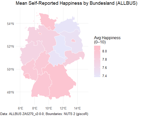
Until recently, most quantitative, standardized studies in the social sciences have relied on survey data. In Germany, one of the flagship representative surveys is the ALLBUS (German General Social Survey) (GESIS-Leibniz-Institut Für Sozialwissenschaften 2019), which records respondents’ federal state of residence in the variable land.
To map survey responses onto geographic boundaries, we can use the giscoR package—an R client for the GISCO (Geographic Information System of the European Commission) open-data repository. GISCO provides a variety of spatial layers, including country outlines, coastlines, labels, and NUTS regions, at multiple resolutions and in three common projections (EPSG:4326, 3035, and 3857) (Hernangómez 2020).
allbus_df <-read_dta("Data/ALLBUS/ZA5270_v2-0-0.dta")#Federal state levelnuts1_de <-gisco_get_nuts(year =2021, nuts_level =1, country ="DE", resolution ="20")allbus_df <- allbus_df |>mutate(land =case_when( land ==10~"Schleswig-Holstein", land ==20~"Hamburg", land ==30~"Niedersachsen", land ==40~"Bremen", land ==50~"Nordrhein-Westfalen", land ==60~"Hessen", land ==70~"Rheinland-Pfalz", land ==80~"Baden-Württemberg", land ==90~"Bayern", land ==100~"Saarland", land %in%c(111, 112) ~"Berlin", # collapse former West/Ost land ==120~"Brandenburg", land ==130~"Mecklenburg-Vorpommern", land ==140~"Sachsen", land ==150~"Sachsen-Anhalt", land ==160~"Thüringen",TRUE~NA_character_ ) )happiness_by_land <- allbus_df |>filter(!is.na(land), !is.na(ls01)) |>group_by(land) |>summarise(mean_happiness =mean(ls01, na.rm =TRUE)) |>ungroup()nuts1_de <- nuts1_de |>left_join(happiness_by_land, by =c("NAME_LATN"="land"))ggplot(nuts1_de) +geom_sf(aes(fill = mean_happiness), color ="white") +scale_fill_gradient(name ="Avg Happiness\n(0–10)",low ="lavender", # pinkhigh ="pink", # lavenderna.value ="grey90" ) +labs(title ="Mean Self-Reported Happiness by Bundesland (ALLBUS)",caption ="Data: ALLBUS ZA5270_v2-0-0; Boundaries: NUTS 2 (giscoR)" ) +theme_minimal()
NUTS-Regions
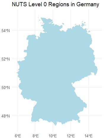
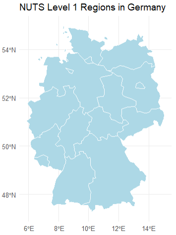
The Nomenclature of Territorial Units for Statistics (NUTS) is an EU standard for dividing member states into hierarchical regions:
NUTS 0: Countries
NUTS 1: Major socio-economic regions (German federal states like “Nordrhein-Westphalen”)
NUTS 2: Basic regions for the application of regional policies (e.g., individual Regierungsbezirke)
NUTS 3: Small regions for specific diagnoses (Kreise or kreisfreie Städte).
Code
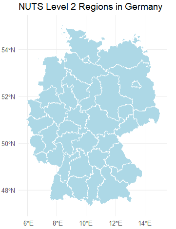
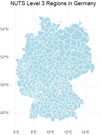
# Plot the regionsggplot(nuts1_de) +geom_sf(fill ="lightblue", color ="white") +labs(title ="NUTS Level 1 Regions in Germany") +theme_minimal()# Download NUTS level 2 regions for Germanynuts2_de <-gisco_get_nuts(nuts_level =2, country ="DE", resolution =1)# Plot the regionsggplot(nuts2_de) +geom_sf(fill ="lightblue", color ="white") +labs(title ="NUTS Level 2 Regions in Germany") +theme_minimal()# Download NUTS level 3 regions for Germanynuts3_de <-gisco_get_nuts(nuts_level =3, country ="DE", resolution =1)# Plot the regionsggplot(nuts3_de) +geom_sf(fill ="lightblue", color ="white") +labs(title ="NUTS Level 3 Regions in Germany") +theme_minimal()# Download NUTS level 4 regions for Germanynuts0_de <-gisco_get_nuts(nuts_level =0, country ="DE", resolution =1)# Plot the regionsggplot(nuts0_de) +geom_sf(fill ="lightblue", color ="white") +labs(title ="NUTS Level 0 Regions in Germany") +theme_minimal()
Because surveys must balance spatial precision with respondent confidentiality, location is typically reported only at NUTS 1 or NUTS 2 level. However, aggregated metadata—such as regional averages or counts—can sometimes be accessed at finer scales.
Importantly, joining survey data to shape files is primarily a descriptive exercise: it adds geographic context for visualization and exploratory analysis, even though it does not generate new information about individual respondents.
Lets try this for ourselves:
You can download a GeoJson with Information on the boundaries of world countries, their name, ISO Code, Affiliated countries from here
Load the world boundaries as an sf object using st_read().
Plot the countries using different Coordinate Reference Systems (CRSs). Observe how these different CRSs change the appearance of the world.
From here you can download the free version of the simplemaps information metadata on the world countries. It contains information on different countries population and economic information.
Add the information from the .csv to your sf-object.
Find the five countries with the highest and lowest median age.
Visualize median age using a color gradient.
Identify which countries drive on the left.
Visualize the driving side on a map.
Climatic data
Environmental sociology examines the dynamic relationship between societies and their natural environments. Within this field, the study of climate impacts—and society’s influence on climate—is rapidly expanding. By leveraging new spatial data sources and geographic tools, we can begin to ask questions such as:
How does exposure to extreme weather influence survey responses on well-being or climate anxiety?
Are people in regions experiencing rapid temperature increases more likely to support ambitious climate policies?
Do variations in precipitation patterns correlate with reported trust in governmental climate initiatives?
For data collection, we can use the geodata package in R (Mandel, Barbosa, and Aniruddha Ghosh 2021), which offers programmatic access to a wide range of global raster and vector datasets, including:
Climate layers (e.g., temperature, precipitation via WorldClim)
Elevation and accessibility metrics
Land use, soil, and crop suitability maps
Species occurrence records
Administrative boundaries at multiple levels
With these tools, you can seamlessly integrate environmental variables into your social-science workflows—linking survey data, policy indicators, and demographic information to enrich your analyses and visualizations.
This is just one example, data can of course also be downloaded or collected via weather channels.
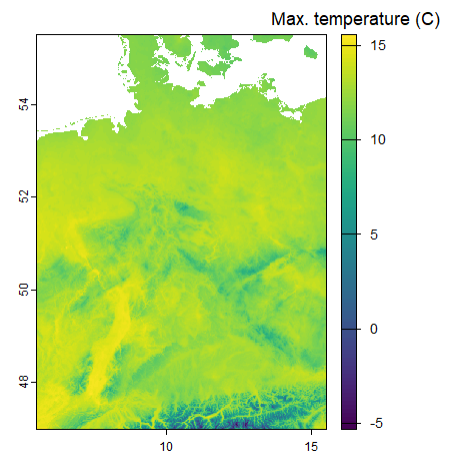
d <-worldclim_country(country ="Germany",res =0.5,var ="tmax",path =tempdir() )terra::plot(mean(d), plg =list(title ="Max. temperature (C)"))
OpenStreetMap Data with osmdata
An API (Application Programming Interface) is a set of rules that allows different programs or computers to communicate with each other and exchange data.
In simple terms, an API tells one program how to ask for information and tells the other program how to send the answer back. This works even if the systems are very different, for example written in different programming languages or located on different computers.
API Illustration
Instead of downloading data manually from a website, we can ask for it directly from R.
Many services provide APIs, for example weather services, map providers, public transport platforms, government data portals, social media platforms, and research databases.
In this example, we use OpenStreetMap data through the Overpass API. OpenStreetMap is especially useful because it is open, community-built, and freely available. This makes it a great data source for learning GIS and working with real-world spatial data.
The R package osmdata acts as a bridge between R and OpenStreetMap. It translates R commands into requests to the Overpass API:
opq() defines where to search.
add_osm_feature() defines what to search for.
osmdata_sf() sends the request and returns the result as sf objects.
This means we can download real OpenStreetMap features, such as streets, hospitals, parks, or buildings, and directly map or analyze them in R.
OpenStreetMap (OSM) is a crowdsourced geographic database maintained by volunteers around the world. With the osmdata package (Padgham et al. 2023), you can pull features like roads, railway stations, schools, supermarkets, and more directly into R as sf objects. A full list of mappable features is on the OSM wiki(Moraga and Baker 2022).
You can inspect which feature keys and tags you might query:
available_features()
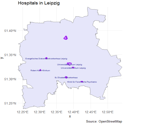
When we create an osmdata query we start by defining a geographical area that we wish to include. This is done by defining a bounding box that defines a geographical area by its bounding latitudes and longitudes. (ESR: ) The bounding box for a given place name can be obtained with the getbb()function. For example the bounding box of Leipzig can be obtained (and saved directly as a simple feature object as follows:
To retrieve the required features of a place defined by the bounding box, we can overpass query this with opq(). Then, the add_osm_feature() function can be used to add the required features to the query. Finally, we use the osmdata_sf() function to obtain a simple feature object of the resultant query.
# turn that polygon into a simple numeric bboxbb <-st_bbox(placebb)# run your query using that numeric bboxhospitals <-opq(bbox = bb) |>add_osm_feature(key ="amenity",value ="hospital") |>#add_osm_feature(key = "name") |>osmdata_sf()#make sure to check if they share the same crs (in this case WGS 84)# Extract OSM resultshospital_points <- hospitals$osm_pointshospital_polygons <- hospitals$osm_polygons# Plot hospitalsggplot() +geom_sf(data = placebb,fill ="lavender",color ="grey50") +geom_sf(data = hospital_points,color ="purple",size =1,alpha =0.7) +geom_sf(data = hospital_polygons,fill ="lavender",color ="purple",alpha =0.4) +geom_sf_text(data = hospital_polygons,aes(label = name),size =2,color ="navy",check_overlap =TRUE ) +coord_sf(expand =FALSE) +labs(title ="Hospitals in Leipzig",caption ="Source: OpenStreetMap" ) +theme_minimal()
Explore OpenStreetMap (OSM) data to identify tram stops (“Tramhaltestellen”) and tram connections in Leipzig. Create a map that plots tram stops as points and displays tram route lines.
Code
bb_leipzig <-getbb("Leipzig, Germany")# Query for public transport stopspt_stops <-opq(bbox = bb_leipzig) |>add_osm_feature(key ="railway", value ="tram_stop") |>osmdata_sf()# Extract points from the resultpt_stops_sf <- pt_stops$osm_points |>filter(!st_is_empty(geometry))pt_lines <-opq(bbox = bb_leipzig) |>add_osm_feature(key ="route", value =c("tram")) |>osmdata_sf()# Extract lines from the resultpt_lines_sf <- pt_lines$osm_lines |>filter(!st_is_empty(geometry))unique(pt_lines_sf$name)# bb_leipzig_bbox <- st_bbox(c(# xmin = bb_leipzig[1,1], ymin = bb_leipzig[2,1],# xmax = bb_leipzig[1,2], ymax = bb_leipzig[2,2]# ), crs = 4326) # WGS84 CRS# # # Then convert bbox to simple feature polygon# bb_sfc <- st_as_sfc(bb_leipzig_bbox)# Plotggplot() +geom_sf(data = placebb, fill ="lavender", color ="grey50") +#geom_sf(data = bb_sfc, fill = "lightgrey", color = "grey50") +geom_sf(data = pt_stops_sf, color ="pink", size =1, alpha =0.7) +geom_sf(data = pt_lines_sf, color ="navy", size =0.8, alpha =0.7) +labs(title ="Public Transport in Leipzig") +theme_minimal()# Boundary box ist nicht sehr genau# Routen sind nicht immer eingetragen# Hat man mit seinem Tag wirklich alle Objects identifiziert?# Es braucht some form of validation
Do you encounter any problems? Why do you think is that?
:::
Measuring space
In social sciences, space is rarely studied as an absolute concept; rather, it is almost always understood relative to a reference point or object — such as the neighborhood around a person’s home or the distance to a resource. For example, measuring distance allows us to map the location of something in relation to something else, or researchers frequently simulate resources to define an egocentric neighborhood — like a 1-kilometer radius around a person’s residence — to study how the built environment influences travel behavior (Frank, Andresen, and Schmid 2004). Due to limited access to detailed (and often confidential) location data, researchers often assign individuals to administrative units like census tracts or zip codes and approximate their location using the centroid of these areas.
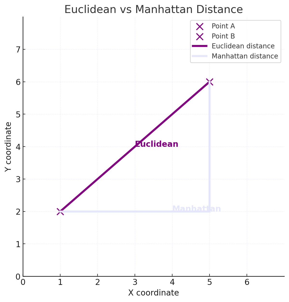
Euclidean distance
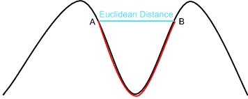
Euclidean distance is the straight-line distance between two points — the shortest path “as the crow flies.” For \(A_{(x_1, y_1)}\) and \(B_{(x_2, y_2)}\), it is calculated by:
\[
d = \sqrt{(x_2 - x_1)^2 + (y_2 - y_1)^2}
\] deriving from the Pythagorean theorem.
Euclidean distance is especially useful when approximating proximity in open, unobstructed spaces or as a baseline measure before considering more complex routes like travel time or street networks.
Using the sf-package we can compute the Euclidean distance using:
dist <-st_distance(doeni, gwz)
Units: [m] [,1] [1,] 1396.006
Manhattan distance
The Manhattan distance is a metric, used to calculate the distance between two points in a gitterartige Pfad. In contrast to the euclidean distance, the manhattan distance measures the sum of absolute differences between two coordinates of points.
The Manhattan distance for n-dimensional vectors is:
The geodesic distance is the shortest distance between two points on a curved surface, measured along the surface itself, rather than a straight line through space.
Network distance
Straight-line (Euclidean) distance is simple and fast to compute but doesn’t reflect the actual travel path people use. In real life, movement is constrained by the layout of the street network.
To capture network-constrained distances (e.g., for walking, cycling, or driving), we can use tools like dodgr (distances on directed graphs) or osrm, which allow for routing on real streets.
In this example, we use dodgr to calculate the shortest distance for cyclists between two points in Leipzig.
library(dodgr)# Download road network for Leipzignet <-dodgr_streetnet("Leipzig", expand =0.05)# Weight the graph (e.g., bycicle profile)graph <-weight_streetnet(net, wt_profile ="bicycle")from <-c(12.3731, 51.3397)to <-c(12.4, 51.35)path_dist <-dodgr_dists(graph, from = from, to = to)print(path_dist)
2519.564 meter.
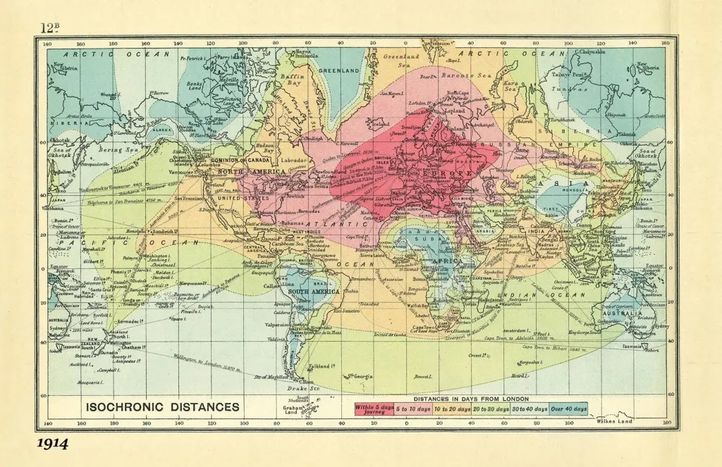
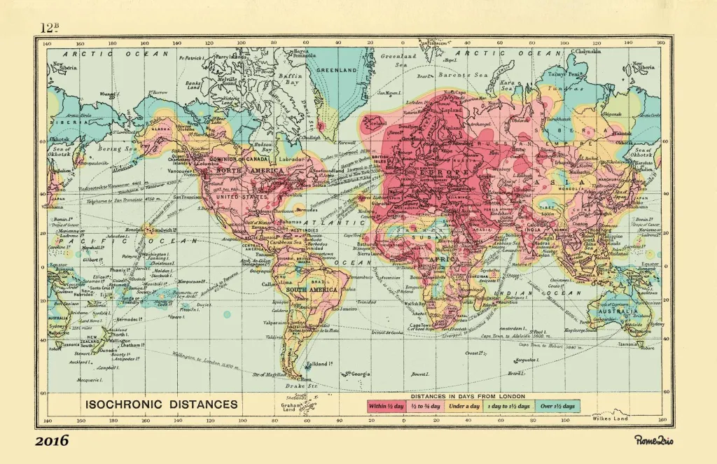
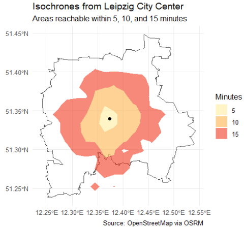
Isochronic distance
Isochronic distance represents how far one can travel from a starting point within a certain amount of time, accounting for actual travel networks, speeds, and possibly time of day.
From rome to rio
From rome to rio
Isochrones are useful for operationalizing accessibility — for example, measuring how many schools or services are reachable within 10 minutes. They are vital in urban planning, transportation analysis, emergency response, and studying spatial inequalities.
Calculating travel time is more complex than straight-line distance because it requires integrating transportation modes, routes, and speeds.
The osrmpackage provides access to travel time and distance data through routing services, enabling isochrone calculations.
Code
library(osrm)# Create an sf POINT for Leipzigleipzig <-data.frame(id ="leipzig",lon =12.3731,lat =51.3397)leipzig_sf <-st_as_sf(leipzig, coords =c("lon", "lat"), crs =4326)# Get isochrones (returns polygons for each time range)iso <-osrmIsochrone(loc = leipzig_sf, breaks =c(5, 10, 15))ggplot() +geom_sf(data = placebb, fill =NA, color ="grey30", size =0.8) +geom_sf(data = iso, aes(fill =factor(isomax)), color =NA, alpha =0.6) +geom_sf(data = leipzig_sf, color ="black", size =2) +scale_fill_brewer(palette ="YlOrRd", name ="Minutes") +labs(title ="Isochrones from Leipzig City Center",subtitle ="Areas reachable within 5, 10, and 15 minutes",caption ="Source: OpenStreetMap via OSRM" ) +theme_minimal()
For comparison, we can measure the size of these isochrome cells by using the main functions of the sf-package.
Code
library(units)# Split by isomax valueiso_5 <- iso |>filter(isomax ==5)iso_10 <- iso |>filter(isomax ==10)iso_15 <- iso |>filter(isomax ==15)iso_5_m <-st_transform(iso_5, 3857)iso_10_m <-st_transform(iso_10, 3857)iso_15_m <-st_transform(iso_15, 3857)area_5 <-st_area(iso_5_m)area_10 <-st_area(iso_10_m)area_15 <-st_area(iso_15_m)# Print areas in square kilometersprint(set_units(area_5, km^2))print(set_units(area_10, km^2))print(set_units(area_15, km^2))
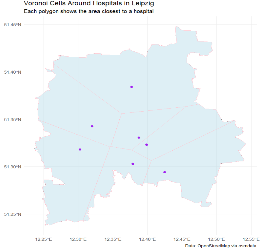
Voronoi-Cells
Voronoi cells (or Thiessen polygons) divide space such that each point in a polygon is closest to one specific service point. Each cell thus represents a catchment area of influence.
When we intersect these polygons with population data (e.g. census blocks or grids) we can approximately measure how many people are assigned (by procimity) to each facility.
We can also compare real administrative zones (e.g. school catchments) to Voronoi-derived zones. Discrepancies reveal potential mismatch between planning and reality.
we can use st_voronoi()for generating Voronoi cells. with `st_intersection() we can check for overlays with population or income data.
# Combine featureshospital_areas <-bind_rows( hospitals$osm_polygons, hospitals$osm_multipolygons)# Get centroids of each featurehospital_pts <- hospital_areas |>st_centroid() |>st_transform(4326) # WGS84 for consistencyhpts <-st_union(hospital_pts)hpts_proj <-st_transform(hospital_pts, 32633) # UTM zone 33Nbb_proj <-st_transform(placebb, 32633)# Create Voronoi diagramvoro_raw <-st_voronoi(st_union(hpts_proj), envelope =st_as_sfc(st_bbox(bb_proj)))# Extract and convert to sfvoro_polygons <-st_collection_extract(voro_raw, "POLYGON")voro_sf <-st_sf(geometry = voro_polygons, crs =32633)voro_clipped <-st_intersection(voro_sf, bb_proj)# Plot Voronoi cells + hospital locationsggplot() +# Background: study area outline (optional)geom_sf(data = placebb, fill =NA, color ="grey40", linetype ="dashed") +# Voronoi polygonsgeom_sf(data = voro_clipped, fill ="lightblue", color ="pink", alpha =0.4) +# Hospital pointsgeom_sf(data = hospital_pts, color ="purple", size =2) +labs(title ="Voronoi Cells Around Hospitals in Leipzig",subtitle ="Each polygon shows the area closest to a hospital",caption ="Data: OpenStreetMap via osmdata" ) +theme_minimal()
Segregation
As (McPherson, Smith-Lovin, and Cook 2001, 430) stated: “the most basic source of homophily is space: We are more likely to have contact with those who are closer to us in geographic location than those who are distant.”
Let’s begin with a powerful visualization by the NYT.
The map is based on census data and shows how racially segregated or integrated American cities are.
Traditionally, segregation is measured through group distributions across fixed geographic units (like census tracks or blocks). An example is the Index of Dissimilarity, which tells us how evenly two groups are spread across neighborhoods.
Michael White (1983) introduced a new perspective: What if we measured segregation based on the actual distance between people. Imagine every person in a city. If white residents tend to live physically closer to other white residents, and Black residents tend to live closer to other Black residents, then the city is spatially segregated—even if they live in neighboring tracts. In this view, segregation isn’t just about which side of the neighborhood boundary people live on—it’s about how far people are from each other, on average. Working with aggregated data for areas such as census tracts, these distances cannot be precisely measured, but they can be estimated, and White proposed an index that could summarize the spatial pattern of an entire city in terms of groups’ relative proximity to one another.
Building on this work, scholars like Reardon and O’Sullivan (2004) have refined ways to calculate spatial segregation more precisely. These newer methods blend spatial relationships with traditional aspatial tools. These methods consider people to have some proximity not only to others in the same block or tract, but also to those who live in nearby areas (Logan 2012).
Bonus: Advanced visualisation using leaflet
Leaflet is a powerful and flexible R package for creating interactive maps. It allows you to combine multiple map layers, including base maps, markers, polygons, and custom shapes. You can customize markers with icons, popups, and labels to provide more context. Leaflet supports different base tiles like OpenStreetMap, Stamen, and CartoDB, giving you options for map style and detail. You can add layers control so users can toggle different datasets on and off. It also supports clustering of many points to keep the map clean and performant. Advanced visualizations can use polygons or polylines to show boundaries, routes, or regions. Leaflet allows dynamic styling of features based on attributes, such as coloring districts by population density. You can integrate leaflet with other R packages like sf for spatial data handling, making it easy to plot shapefiles or geojson. It supports adding legends, scale bars, and even custom JavaScript for interactivity. Popups and tooltips provide detailed info when users hover or click on map elements. Heatmaps and choropleth maps are possible through add-on packages or custom coding. Leaflet maps can be saved as HTML files, embedded in R Markdown, or Shiny apps for interactive web dashboards. Using leaflet proxies, you can update maps dynamically in response to user input without redrawing everything. Overall, leaflet provides a versatile environment to create maps from simple point plots to complex, multi-layered geographic visualizations.
Code
# Define Leipzig coordinatesleipzig_coords <-c(12.3731, 51.3397) # lon, lat# Your Lieblingsdöner coordinates (example: replace with your actual location)doener_coords <-c(12.3848, 51.3390)# Create leaflet mapm <-leaflet() |>addProviderTiles(providers$CartoDB.Positron) |># Add polygon of Germany outline (optional: simplified for this example)addPolygons(data = nuts0_de, # you can load Germany shape as sf object here for boundaryfillColor ="lavender", color ="black", weight =2) |># Add a circle around Leipzig to highlight itaddCircles(lng = leipzig_coords[1], lat = leipzig_coords[2],radius =10000, color ="pink", fillOpacity =0.2,popup ="Leipzig") |># Add a marker for your LieblingsdoeneraddMarkers(lng = doener_coords[1], lat = doener_coords[2],popup ="Mein Lieblingsdöner 🌯") |># Set initial view roughly centered on GermanysetView(lng =10.0, lat =51.0, zoom =6)saveWidget(m, "my_leaflet_map.html")
(15 minutes)
In groups of three, think of a sociological question where space plays an important role—either as a key variable or as a context.
Discuss how you might operationalize “space” in this question.
Reflect on the possible methods you could use to measure spatial aspects.
Identify potential limitations or challenges in using spatial data for your question.
References
Abbott, Andrew. 1997. “Of Time and Space: The Contemporary Relevance of the Chicago School*.”Social Forces 75 (4): 1149–82. https://doi.org/10.1093/sf/75.4.1149.
Frank, Lawrence D., Martin A. Andresen, and Thomas L. Schmid. 2004. “Obesity Relationships with Community Design, Physical Activity, and Time Spent in Cars.”American Journal of Preventive Medicine 27 (2): 87–96. https://doi.org/10.1016/j.amepre.2004.04.011.
GESIS-Leibniz-Institut Für Sozialwissenschaften. 2019. “ALLBUS/GGSS 2018 (Allgemeine Bevölkerungsumfrage der Sozialwissenschaften/German General Social Survey 2018)Allgemeine Bevölkerungsumfrage der Sozialwissenschaften ALLBUS 2018.” GESIS Data Archive. https://doi.org/10.4232/1.13250.
Mandel, Robert J. Hijmans, Màrcia Barbosa, and Alex Aniruddha Ghosh. 2021. “Geodata: Download Geographic Data.” Comprehensive R Archive Network. https://doi.org/10.32614/CRAN.package.geodata.
McPherson, Miller, Lynn Smith-Lovin, and James M. Cook. 2001. “Birds of a Feather: Homophily in Social Networks.”Annual Review of Sociology 27: 415–44. https://www.jstor.org/stable/2678628.
Moraga, Paula. 2024. Spatial Statistics for Data Science: Theory and Practice with R. First edition. Chapman & Hall/CRC Data Science Series. Boca Raton: CRC Press, Taylor & Francis Group.
Moraga, Paula, and Laurie Baker. 2022. “Rspatialdata: A Collection of Data Sources and Tutorials on Downloading and Visualising Spatial Data Using R.” https://f1000research.com/articles/11-770. https://doi.org/10.12688/f1000research.122764.1.
Padgham, Mark, Bob Rudis, Robin Lovelace, Maëlle Salmon, Joan Maspons, Andrew Smith, James Smith, et al. 2023. “Osmdata: Import ’OpenStreetMap’ Data as Simple Features or Spatial Objects.”
Pebesma, Edzer. n.d. “Simple Features for R.” https://r-spatial.github.io/sf/articles/sf1.html. Accessed May 27, 2025.
Pebesma, Edzer, and Roger Bivand. 2023. Spatial Data Science: With Applications in R. 1st ed. New York: Chapman and Hall/CRC. https://doi.org/10.1201/9780429459016.