Code
library(needs)
needs(igraph,
igraphdata,
netseg)
data("UKfaculty")
help("UKfaculty")library(needs)
needs(igraph,
igraphdata,
netseg)
data("UKfaculty")
help("UKfaculty")Welcome to this session of the seminar CSS!
Different theories on roles and conflicts between roles draw on this idea, that society exists were different individuals interact with each other. Economic, social, and political actions are embedded in social networks and relationships. This means that individuals and organizations are not isolated actors, but are instead part of a larger web of social connections that shape their behavior and decision-making.
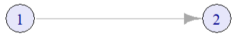
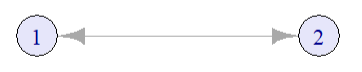
Measures of reciprocity are based on the dyad census: Any pair of vertices in a network is called a dyad. There are three possible states of dyads (in a directed network): null dyads (no edge), b) asymmetric dyads (one directed edge) and c) mutual dyads (two directed edges).
null <- graph_from_literal(1, 2)
as <- graph_from_literal(1-+2)
mutual <- graph_from_literal(1-+2, 2-+1)
g <- graph_from_literal(1-+2, 2-+3, 2+-3, 5-+2, 3--+5, 5-+3, 3-+4)
layout_line <- cbind(1:2, rep(1, 2))
plot(null,
vertex.color = "lavender",
vertex.size = 30,
layout = layout_line)
plot(as,
vertex.color = "lavender",
vertex.size = 30,
layout = layout_line)
plot(mutual,
vertex.color = "lavender",
vertex.size = 30,
layout = layout_line)
# Plotte das Netzwerk mit Lavender vertices
plot(g,
vertex.color = "lavender",
vertex.size = 30,
edge.width = 2,
arrow.size = 0.1,
layout = layout_with_fr)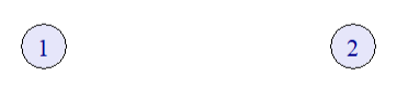
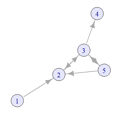
| null | asymmetric | mutual |
|---|---|---|
| 5 | 3 | 2 |
dyad_census(g)
UKfaculty <- upgrade_graph(UKfaculty)
UKfaculty <- simplify(UKfaculty)
dyad_census(UKfaculty)The level of reciprocity shows whether a network mainly consists of mutual or asymetrical edges and can be calculated in R using either ‘default’-mode (number of reciprocated edges divided by the total number of edges) or ‘ratio’-mode (number of mutual dyads divided by the number of asymmetric dyads).
reciprocity(UKfaculty, mode="default")
reciprocity(UKfaculty, mode="ratio")Describing the relationships of nodes draws back on mathematical relations. The following table summarizes the most important relations:
| Property | Definition |
|---|---|
| Reflexive | ∀ a ∈ A: (a, a) ∈ R |
| Symmetric | ∀ a, b ∈ A: (a, b) ∈ R ⇒ (b, a) ∈ R |
| Transitive | ∀ a, b, c ∈ A: (a, b) ∈ R ∧ (b, c) ∈ R ⇒ (a, c) ∈ R |
| Asymmetric | ∀ a, b ∈ A: (a, b) ∈ R ⇒ (b, a) ∉ R |
| Antisymmetric | ∀ a, b ∈ A: (a, b) ∈ R ∧ (b, a) ∈ R ⇒ a = b |
| Irreflexive | ∀ a ∈ A: (a, a) ∉ R |
| Complete | ∀ a, b ∈ A: (a, b) ∈ R ∨ (b, a) ∈ R |
Any set of 3 vertices in a network is called a triad. In directed networks, 16 different triads exist (Davis and Leinhardt 1967).
# Define all 16 triad types using adjacency matrices
triad_matrices <- list(
matrix(c(0,0,0, 0,0,0, 0,0,0), nrow=3, byrow=TRUE), # 003
matrix(c(0,1,0, 0,0,0, 0,0,0), nrow=3, byrow=TRUE), # 012
matrix(c(0,1,0, 1,0,0, 0,0,0), nrow=3, byrow=TRUE), # 102
matrix(c(0,1,1, 0,0,0, 0,0,0), nrow=3, byrow=TRUE), # 021D
matrix(c(0,0,0, 1,0,0, 1,0,0), nrow=3, byrow=TRUE), # 021U
matrix(c(0,1,0, 0,0,1, 0,0,0), nrow=3, byrow=TRUE), # 021C
matrix(c(0,1,0, 1,0,0, 1,0,0), nrow=3, byrow=TRUE), # 111D
matrix(c(0,1,0, 1,0,1, 0,0,0), nrow=3, byrow=TRUE), # 111U
matrix(c(0,1,1, 0,0,0, 0,1,0), nrow=3, byrow=TRUE), # 030T
matrix(c(0,1,0, 0,0,1, 1,0,0), nrow=3, byrow=TRUE), # 030C
matrix(c(0,1,1, 1,0,0, 1,0,0), nrow=3, byrow=TRUE), # 201
matrix(c(0,1,1, 0,0,1, 0,1,0), nrow=3, byrow=TRUE), # 120D
matrix(c(0,0,0, 1,0,1, 1,1,0), nrow=3, byrow=TRUE), # 120U
matrix(c(0,1,1, 0,0,1, 1,0,0), nrow=3, byrow=TRUE), # 120C
matrix(c(0,0,1, 1,0,1, 1,1,0), nrow=3, byrow=TRUE), # 210
matrix(c(0,1,1, 1,0,1, 1,1,0), nrow=3, byrow=TRUE) # 300 (mutual all)
)
triad_names <- c("003", "012", "102", "021D", "021U", "021C", "111D", "111U", "030T", "030C",
"201", "120D", "120U", "120C", "210", "300")
# Plot each triad
par(mfrow = c(4, 4), mar = c(1, 1, 2, 1)) # 4x4 grid layout
for (i in 1:16) {
adj <- triad_matrices[[i]]
g <- graph_from_adjacency_matrix(adj, mode = "directed")
plot(
g,
main = triad_names[i],
vertex.color = "lavender",
vertex.size = 30,
vertex.label = NA,
vertex.label.cex = 0,
edge.arrow.size = 0.3,
layout = layout_in_circle
)
}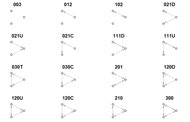
The codes like 102, 021C, 120U may feel cryptic at first, but they follow a logical pattern:
Basic structure: Three-digit code
Example: ‘102’
| Digit | Meaning |
|---|---|
1 |
1 mutual (reciprocal) relationship (e.g., A ↔︎ B) |
0 |
0 one-way relationships |
2 |
2 node pairs have no relationship |
Add-On lettering:
For more complex cases, a letter is added to describe the triad’s shape or direction:
| Code | Description |
|---|---|
021D |
Two one-way edges going down (A → B → C) |
021U |
Two one-way edges going up (C → B → A) |
021C |
A circle of one-way edges (A → B → C → A) |
030T |
A transitive triangle (A → B → C and A → C) |
030C |
A cycle with three one-way edges (A → B → C → A) |
120D |
One mutual edge, two one-way edges in a downward direction |
120U |
One mutual edge, two one-way edges in an upward direction |
120C |
A circle-like pattern with mutual + one-way ties |
210 |
Two mutual dyads and one one-way edge |
300 |
All three dyads are mutual (fully connected triad) |
We can compute the triad census of a network using
triad_census(UKfaculty)
# nice layout
tbl <- data.frame(t(triad_census(UKfaculty)))
colnames(tbl) <- c("003", "012", "102", "021D", "021U", "021C", "111D", "111U", "030T", "030C", "201", "120D", "120U", "120C", "210", "300")
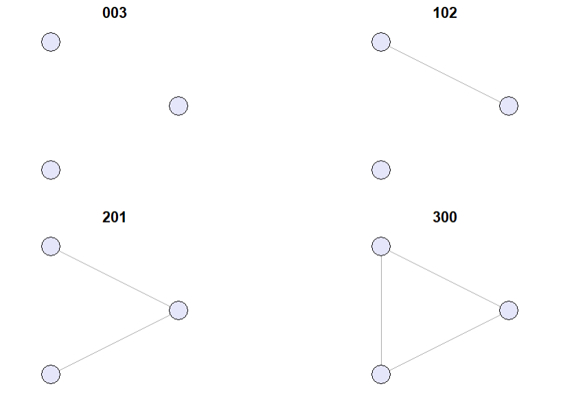
tblIn undirected networks only 4 distinct triads exist.
# Define the 4 undirected triad types
undirected_triad_matrices <- list(
matrix(c(0,0,0, 0,0,0, 0,0,0), nrow=3, byrow=TRUE), # 0 edges: Empty (Type: 003)
matrix(c(0,1,0, 1,0,0, 0,0,0), nrow=3, byrow=TRUE), # 1 edge: One dyad (Type: 102)
matrix(c(0,1,1, 1,0,0, 1,0,0), nrow=3, byrow=TRUE), # 2 edges: Open triad (Type: 201)
matrix(c(0,1,1, 1,0,1, 1,1,0), nrow=3, byrow=TRUE) # 3 edges: Complete triad (Type: 300)
)
undirected_triad_names <- c("003", "102", "201", "300")
# Plot each undirected triad
par(mfrow = c(2, 2), mar = c(1, 1, 2, 1)) # 2x2 grid layout
for (i in 1:4) {
adj <- undirected_triad_matrices[[i]]
graph <- graph_from_adjacency_matrix(adj, mode = "undirected")
plot(
graph,
main = undirected_triad_names[i],
vertex.color = "lavender",
vertex.label = NA,
vertex.size = 30,
vertex.label.cex = 0,
layout = layout_in_circle
)
}
Triadic closure is a concept in social network theory that was first introduced by Georg Simmel. It describes the tendency of two nodes \(A\) and \(B\) to become connected if they share a common neighbor \(C\). It can be used to understand and predict the formation of social ties in network (of course, there are many other factors influencing tie formation).
A clustering coefficient is a measure of the degree to which vertices in a graph tend to cluster together. Evidence suggests that in most social networks, groups tend to create highly clustered subgroups.
Global clustering coefficient or transitivity:
In an undirected graph a connected triple is a path of length 2 (i.e. triad 201). A triangle is a cycle of exactly three nodes (i.e. triad 300). The global clustering coefficient is then defined as
\[ G_g = \frac{(\text{number of triangles} \times 3)}{(\text{number of connected triples})} \]
transitivity(UKfaculty, type = "global")Heiders balance theory [-heiderPsychologyInterpersonalRelations1958] that explores how individuals perceive and maintain balance in their social relationships.
It involves triads of entities typically represented as a Person \(P\), another Person \(O\), and and Object \(X\).
If \(P\) likes \(X\) but dislikes \(O\), and then learns that \(O\) likes \(X\), then \(P\) will feel uncomfortable and will try to restore balance by either changing their attitude towards \(O\) or \(X\).
Cognitive balance is achieved, when there are three positive links or two negatives with one positive.
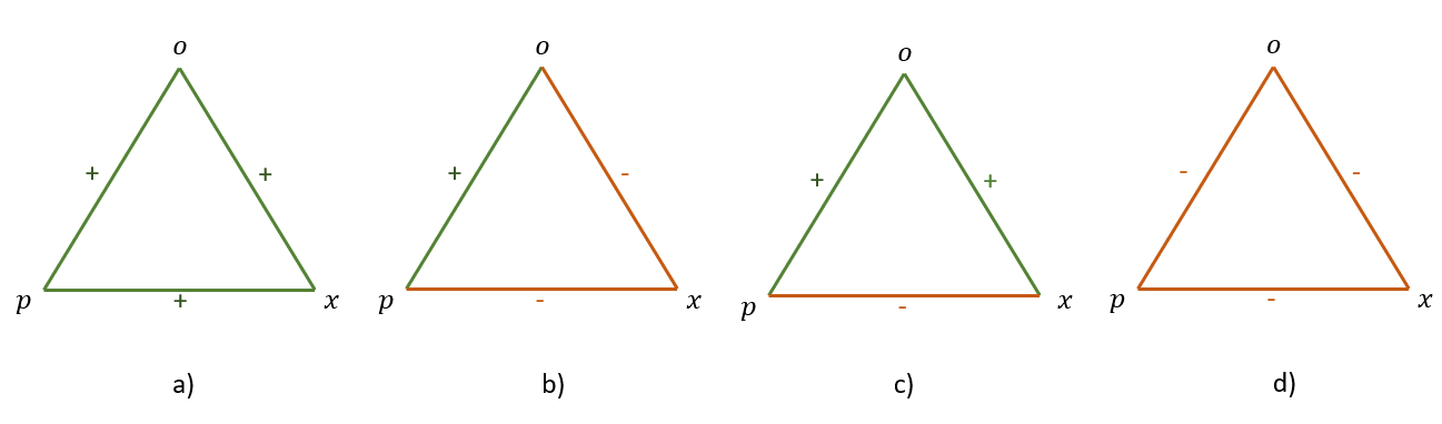
A signed graph is a graph where each edge has a sign (positive or negative). The sign of an edge can represent the nature of the relationship between two nodes. For example, in social networks, a positive edge might represent friendship, while a negative edge might represent enmity or dislike.
Cartwright and Harari(1956) extended Heider’s theory into graph theory, modeling people as nodes and their sentiments as signed edges (+ for friendship, − for hostility). They viewed triads as 3-cycles in a signed graph.
A fully signed graph is balanced, if every triad in it is balanced.
Additional assumption: A triad with three negative edges is also considered balanced (Davis 1967).
Then a graph is called groupable if it can be partitioned into two groups such that all edges between the groups are positive and all edges within the groups are negative.
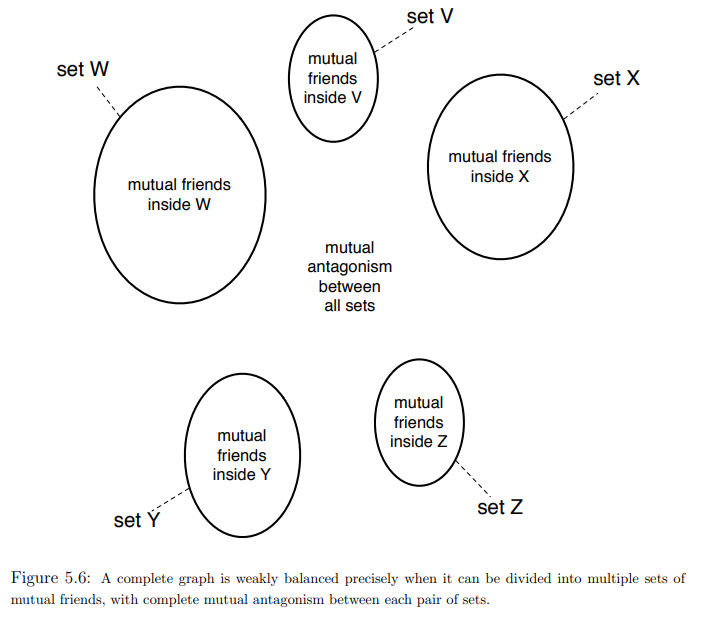
Segregation: network level property-Segregation refers to the extent to which actors and social groups are separated from another. Segregation exists if the share of ties between groups is much less pronounced than the share of in-group ties, or if the groups are fully separated from each other.
The literature does not agree regarding the exact terminology of homophily and segregation. To some authors, homophily refers to both the macro-phenomenon (lack of intergroup relationships) and the micro-mechanism (similarity preferences). To others, homophily refers to the macro-phenomenon and homophilic or homophilious selection refer to the micro-mechanism.
I concur with other researchers on the terminology of homophily (preferences) for the mechanism and segregation for the macro-pattern.
# Check the attributes available in the dataset
vertex_attr_names(UKfaculty)
# Assign different colors to each unique group
group_colors <- rainbow(length(unique(V(UKfaculty)$Group)))
# Create a vector of colors for each vertex based on its group
vertex_colors <- group_colors[V(UKfaculty)$Group]
# Plot the graph with vertex colors based on the 'Group' attribute
plot(UKfaculty, vertex.color = vertex_colors)
Previous research has found evidence of homophily regarding:
Other, secondary types of homophily can reinforce segregation on an attribute. Example: Ethnic segregation can be reinforced by socioeconomic homophily, when ethnic origin (node color) and socioeconomic status (node shape) overlap (e.g., many ethnic minority members have a lower socioeconomic status and many ethnic majority members have a higher socioeconomic status)
For an explanation see (Wimmer and Lewis 2010, 588–94)
Let \(e_{AB}\) be the number of edges between two types of actors \(A\) and \(B\) (e.g. different faculties) and \(m\) be the total numbers of edges in the network. Then homophily exists if \(\frac{e_{AB}}{m}\) is significantly lower than the probability of a random connection between two actors from type \(A\) and type \(B\).
groups <- V(UKfaculty)$Group
n <- vcount(UKfaculty)
edges <- as_edgelist(UKfaculty)
e_AB <- sum(
(groups[edges[,1]] == 1 & groups[edges[,2]] == 2) |
(groups[edges[,1]] == 2 & groups[edges[,2]] == 1)
)
m <- ecount(UKfaculty)
obs_prob <- e_AB / m
obs_prob
# Calculate the expected probability of a random connection between type A and type B
p_A <- sum(groups == 1) / n
p_B <- sum(groups == 2) / n
rand_prob <- 2 * p_A * p_B # factor 2 because A-B and B-A edges
rand_prob
obs_prob < rand_probWe can also use the assortavity coefficient for measurement.
Assortavity coefficients are basically correlation coefficients that (in the case of categorical variables) can be measured by \(e_{i,j}\) being the ratio of edge from actors of type \(i\) to type \(j\)
Let \(e_{ij}\) be the ratio of edges from actors of type \(i\) to type \(j\).
\(a_i = \sum_j e_{ij} \quad \text{(ratio of edges outgoing from actors of type \( i \))}\)
\(b_j = \sum_i e_{ij} \quad \text{(ratio of edges incoming to actors of type \( j \))}\)
The assortativity coefficient ( r ) is defined as:
\[ r = \frac{\sum_{i}e_{ii}-\sum_{i}a_ib_i}{1-\sum_{i}a_ib_i} \]
\(r = 0 \quad \text{if} \quad e_{ii} = a_i b_i \quad \text{(random connections)}\)
\(r = 1 \quad \text{if} \quad \text{only actors of the same type are connected}\)
\(r = - \frac{\sum_i a_i b_i}{1 - \sum_i a_i b_i} \quad \text{if} \quad \text{only actors of different types are connected}\)
# types are assumed to be integers starting with one
assortativity_nominal(UKfaculty, types = V(UKfaculty)$Group + 1)or odds-ratios of within-group ties (Bojanowski and Corten 2014)
orwg(UKfaculty, "Group")telling us, that same-group tie odds are 12.866 times greater than tie odds between groups.
or Colemans Index (Coleman 1958) that compares the proportion of same-group neighbours to the proportion of that group in the network as a whole.
coleman(UKfaculty, "Group")which compares the proportion of same-group neighbors to the proportion of that group in the network as a whole. It is a number between -1 and 1. Value of 0 means these proportions are equal. Value of 1 means that all ties outgoing from a particular group are sent to the members of the same group. Value of -1 is the opposite – all ties are sent to members of other group(s).
Measuring homophily preferences is difficult as we cannot directly observe preferences. In the social networks literature, the most common ways to estimate the strength of homophily preferences are Exponential Random Graph Models (ERGMs) and Stochastic Actor-Oriented Models (SAOMs). These estimate the existence of ties in dependence of actor attributes (such as similarity).
Another approach to testing homophily preferences are permutation tests. A permutation is the result of a random reshuffle of the row and column names in an adjacency matrix. This creates a random network with the same structural properties (e.g., reciprocated ties) as the observed network. Who is connected to whom is, however different now. The level of segregation in the permuted network is now solely based on the network composition. If we permute the network a large number of times, we receive a distribution of segregation values expected due to the network composition. Then, we can test whether the observed segregation is statistically significant from the distribution of permutations. A significant difference tells us that preferences are (likely) the reason for the difference between the mean of the permutations and the observation. We, however, do not know which preferences are responsible!
set.seed(1)
n_perm <- 1000
perm_vals <- numeric(n_perm)
for (i in 1:n_perm) {
perm_groups <- sample(groups)
e_AB_perm <- sum(
(perm_groups[edges[,1]] == 1 & perm_groups[edges[,2]] == 2) |
(perm_groups[edges[,1]] == 2 & perm_groups[edges[,2]] == 1)
)
perm_vals[i] <- e_AB_perm / m
}
p_value <- mean(perm_vals <= obs_prob)
p_valueGranovetters paper is one of the most cited papers in sociology (right after Foucault) and social network analysis. It has been cited 76.037 (last checked on 04/28/25) times and is considered foundational work in the field of social network analysis. The concept of the strength of weak ties has been widely applied in various fields, including sociology, communication studies, and organizational behavior.
Following Granovetter, the strength of ties is measured by the amount of time, emotional intensity, intimacy, and reciprocal services that characterize the tie. Granovetter explicitly differentiates between strong and weak ties.
Networks follow a so called transitivity tendency meaning that if \(A\) is connected to \(B\) and \(C\), then \(B\) and \(C\) are more likely to be (positively) connected to each other than if \(A\) was not connected to either of them. This is also called the triadic closure property of networks. This is due to meeting opportunities, homophily and structural balance.
Following these arguments, Granovetter calls triads, in which \(A\) has strong ties to \(B\) and \(C\), but no tie exists between \(B\) and \(C\), forbidden triads. He argues that these triads are unstable and will be dissolved over time. Empirically forbidden triads occur in core networks.

With this in mind, Granovetter argues that the transitivity tendency a function of strength of ties and not a general property of networks. Going through the mechanisms that drive the transitivity tendency. this becomes more obvious.
Meeting opportunities: If \(A\) has weak ties to \(B\) and \(C\), they less often interact if it where strong ties. This means that the likelihood of \(B\) and \(C\) meeting is lower than if \(A\) has strong ties to both of them.
Homophily: People have a preference to interact with people who are similar to them. If they aren’t relationsships are probably more superficial and instrumental. This means that the likelihood of \(B\) and \(C\) being similar is lower than if \(A\) has strong ties to both of them.
Balance theory: In the case of weak ties, people are less strained by cognitive disbalance.
This is also empirically supported: Core networks of friends have stronger triadic closure than peripheral networks of acquaintances.
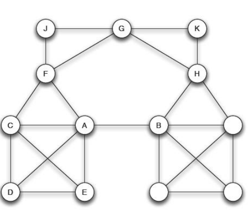
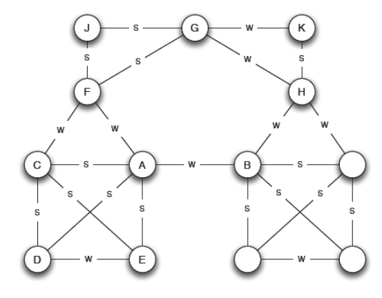
The fact that people play different roles and have different influences inside groups and communities has motivated centuries of sociological and psychological research, so it is unsurprising that the concept of vertex importance and influence is of great interest in the study of people or organizational networks.
But importance and influence are not precisely defined concepts, and to make them real within the context of graphs and networks we need to find some sort of mathematical definition for them. In many visual graph layouts, more important or influential vertices that have stronger roles in overall connectivity will usually be positioned toward the center of a group of other vertices. Intuitively therefore, we use the term ‘centrality’ to describe the importance or influence of a vertex in the connected structure of a graph.
# Edgelist from Ona Book
g <- graph_from_literal(1--2, 3--4, 4--1, 4--2, 4--5, 4--6, 6--7, 4--6, 7--8, 8--4, 8--9, 9--10, 10--11, 11--12, 9--13, 13--14, 11--12, 12--10, 7--4)
ecount(g)
V(g)$color <- "lavender"
V(g)$label.color <- "darkgrey"
# Plotten
plot(g,
vertex.size = 20,
vertex.label.cex = 0.8)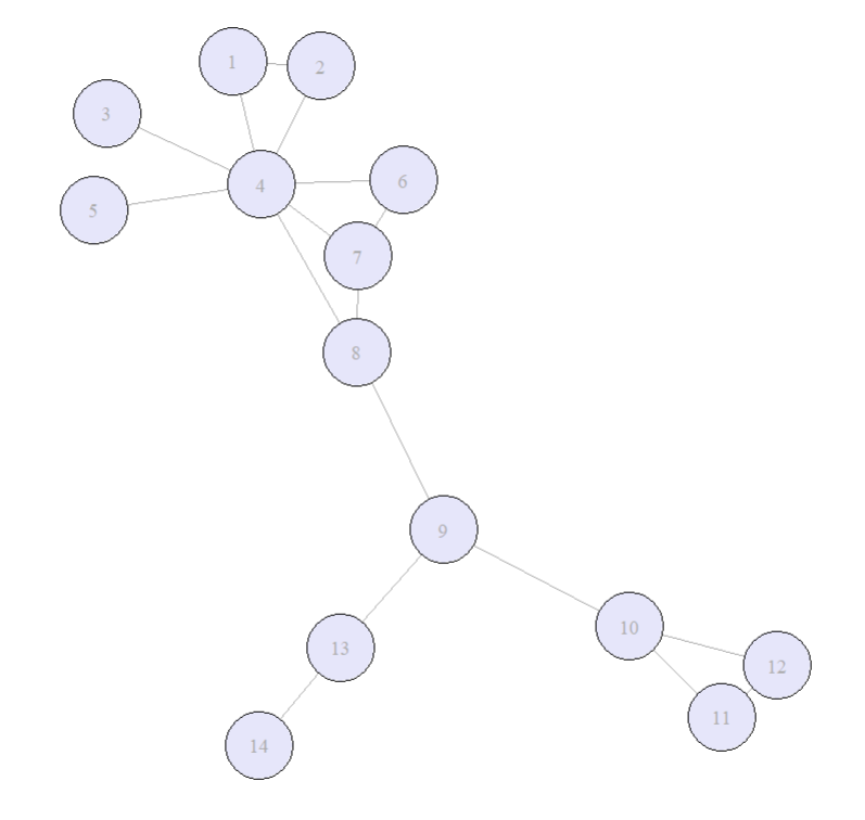
The degree centralty (or valence) of a vertex \(v\) is the number of edges connected to \(v\). Its thus a measure of immediate connections. Related to the concept of degree is the ego size. The \(n\)th order ego network of a given vertex \(v\) is the set including \(v\) itself and all vertices that are reachable from \(v\) by a path of length \(n\). The size of the \(n\) th order ego network is the number of vertices in it.
Out-degree: the number of edges going out from a vertex.
In-degree: the number of edges going into a vertex.
# degree centrality in r
degree(g, mode = "all")
degree(UKfaculty, mode = "in")
degree(UKfaculty, mode = "out")The closeness centrality of a vertec \(x\) in a connected graph is the inverse of the sum of the distances from \(x\) to all other vertices. Through inverting the distancematrix we make sure, that lower total distances will generate higher closeness centrality scores. In connected graphs is defined as:
\[ C_B(x) = \frac{1}{\sum_{y \in V} d(x,y)} \]
where \(d(x,y)\) is the distance between vertices \(x\) and \(y\).
closeness(g, mode = "all")
closeness(UKfaculty, mode = "in")
closeness(UKfaculty, mode = "out")The betweenness centrality of a vertex \(v\) is the number of shortest paths between all pairs of vertices that pass through \(v\). In connected graphs is defined as:
\[ C_B(v) = \sum_{s. t \in V \\ s \neq v \neq t} \frac{\sigma_{st}(v)}{\sigma_{st}} \]
where \(\sigma_{st}\) is the number of shortest paths between vertices \(s\) and \(t\) and \(\sigma_{st}(v)\) is the number of those paths that pass through \(v\).
betweenness(g, directed = FALSE)
betweenness(UKfaculty, directed = TRUE)The Eigenvector centrality (or prestige) is a measure of how connected a vertex is to other influential vertices in the graph. Relative scores are assigned to each vertex based on the scores of its neighbors. It can be calculated using the adjacency matrix of the graph.
For a given graph \(G\) = (V,E), let \(A = (a_{v,t})\) be the adjacency matrix, i.e. \(a_{v,t} = 1\) if vertex \(v\) is linked to vertex \(t\), and \(a_{v,t} = 0\) otherwise. The relative centrality score, \(x_v\), of vertex \(v\) can be defined as:
\[ {\displaystyle x_{v}={\frac {1}{\lambda }}\sum _{t\in M(v)}x_{t}={\frac {1}{\lambda }}\sum _{t\in V}a_{v,t}x_{t}} \]
where \(M(v)\) is the set of neighbors of vertex \(v\) and \(\lambda\) is a constant. The centrality score of a vertex is proportional to the sum of the centrality scores of its neighbors. The constant \(\lambda\) is the largest eigenvalue of the adjacency matrix.
eigen_centrality(g, directed = FALSE)
eigen_centrality(UKfaculty, directed = TRUE)We have not looked at the impact of edge weights on centrality in this chapter. This is because it is unusual to consider edge weights in centrality measures. However most centrality measures can be adapted to take edge weights into account. This could be an interesting lookout as a subject for your final project.
The local clustering coefficient gives an indication of the of the extend of clustering of a single vertex (How close its neighbors are to being a clique (complete graph).
Let \(G = (V, E)\) be an undirected simple graph1 with \(V\) vertices and \(E\) edges. \(n\) is the total number of vertices in the graph, \(m\) the total number of edges.
The neighborhood \(N_i\) of a vertex \(v_i\) are its immediate neighbors and defined as followed:
\[ N_i = \{v_j : e_{ij} \in E \wedge e_{ji} \in E\} \]
We define \(k_i\) as he number of vertices \(|N_i|\) in the neighborhood of \(v_i\). The local clustering coefficient of a vertex \(v_i\) is the proportion of edges between the vertices within its neighborhood divided by the number of edges that could possibly exist between them.
Thus we define the local clustering coefficient of a vertex \(v_i\) as:
\[ C_i = \frac{\{|e_{jk} : v_j, v_k \in N_i, e_{jk} \in E|\}}{k_i (k_i-1)} \]
where \(e_{ij}\) is the number of edges between the vertices in the neighborhood of \(v_i\) and \(k_i\) is the number of vertices in the neighborhood of \(v_i\).
transitivity(g, type = "local")Granovetter’s theory of the strength of weak ties suggests that weak ties (i.e., acquaintances) can be more valuable than strong ties (i.e., close friends) in terms of information flow and access to new opportunities. This is because weak ties often connect individuals to different social groups, providing access to diverse information and resources that may not be available within one’s immediate social circle.
# Define the edges
edges <- c(
1,2, 1,3, 2,3, # Triad 1: nodes 1,2,3 fully connected
4,5, 4,6, 5,6, # Triad 2: nodes 4,5,6 fully connected
3,4 # Weak tie between the two triads
)
# Create the graph
weak <- make_graph(edges, directed = FALSE)
# Plot the graph
plot(weak,
vertex.size=30,
vertex.color = "lavender",
edge.width=c(rep(2,6), 0.5), # Thicker edges within triads, thin edge for weak tie
edge.color=c(rep("black",6), "gray")
) # Force-directed layout for nice separation
# Add a legend
legend("bottomleft",
legend = c("Strong Tie", "Weak Tie"),
col = c("black", "gray"),
lwd = c(2, 1),
bty = "n")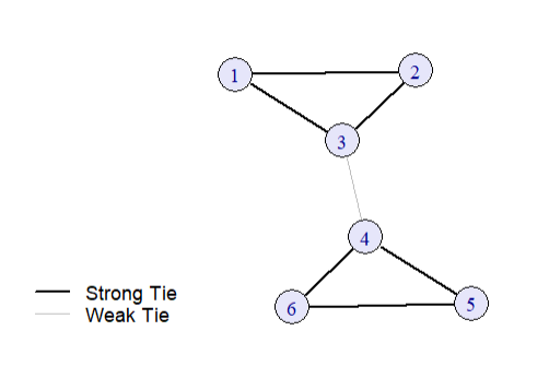
The connection between the two triads is a weak tie, while the connections within each triad are strong ties. The weak tie (3-4) allows for information flow between the two otherwise disconnected groups.
Empirically, bridges are extremely rare in social networks.
This is why we also introduce the notion of local bridges.
Edge {A,B} is a local bridge if its endpoints \(A\) and \(B\) have no contacts in common. So if deleting the edge will increase the distance between \(A\) and \(B\) with more than 2. So it provides their endpoints with access to parts of the network that otherwise would be far away.
While most social structures tend to be characterized by dense clusters of strong connections, some individuals can act as mediators between these clusters. These individuals are often referred to as brokers and according to Burt (1995) they can benefit from their position as brokers between two or more groups. Burt calls the space between two groups a structural hole.
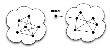
Burt introduces the measurement of constraint to measure the degree to which a vertex is constrained by its neighbours.
High constraint = your friends know each other a lot → your network is tight and redundant.
Low constraint = your friends are mostly independent → you can bridge different groups (you have more “social capital”).
\[ C_i = \sum_{j \in V_i \setminus \{i\}} \left( p_{ij} + \sum_{q \in V_i \setminus \{i,j\}} p_{iq} p_{qj} \right)^2 \]
constraint(g,
nodes = V(g),
weights = NULL
)Why can it be meaningful to analyze dyads and triads instead of whole networks?
What does a high level of reciprocity mean socially?
Give examples of:
How could we represent these in a graph?
What are possible explanations for triadic closure in networks?
Which triad is more stable and why?
Why can weak ties be more valuable than strong ties?
When can strong ties be more valuable than weak ties?
Following Granovetter, why must every local bridge be a weak tie?
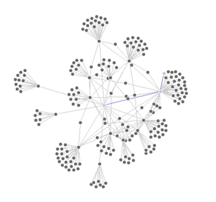
In the network above: which vertex is the most important one? Think about:
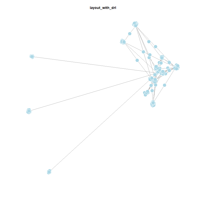
It is quite difficult to sensefully map 3D Information in a two dimensional space (Ognyanova 2024) and (Rawlings et al. 2023).
library(needs)
needs(tidygraph,
ggraph,
igraph,
ggplot2,
dplyr,
gganimate,
networkD3,
dplyr,
tidyr,
tibble,
stringr,
gridExtra,
htmlwidgets,
intergraph
)
setwd("C:/Users/ls68bino/Documents/GitHub/leostnbrk.github.io/computational-social-sciences") When we design a network visualization, like almost always we first need to think about the purpose of the visualization. What are the structural features we want to show? What do we want to communicate?
Most of the time, we will want to show a combination of these features.
When we talk about network visualisation, there are different forms of representation, that we can use. The most common we call network maps, a visualitsation of the nodes and edges in a two-dimensional space. But we can use other forms of representation as well, like
Today we will focus mostly on network maps.
When mapping networks we have different design-elements, that we can use to represent the nodes and edges. The most common are: Color, Position, Size, Shape and Position as well as labels.
Colors are extremely useful in plotting to differentiate between types of objects or different values of variabes.
Colors can be called by using either named colors, hex or RGB values.
In base R, we can plot by defining point coordinates, symbol shapes, point size and color:
plot(x=1:10,
y=rep(5,10),
pch=9,
cex=3,
col="lavender")
points(x=1:10,
y=rep(6, 10),
pch=1,
cex=3,
col="#B43757"
)
points(x=1:10,
y=rep(4, 10),
pch=7,
cex=3,
col=rgb(175, 105, 238, maxColorValue=255)
)
We can also set the the opacity of our colors by using alpha in rgb. The alpha value can be set between 0 (transparent) and 1 (opaque).
plot(x=1:5,
y=rep(5,5),
pch=19,
cex=12,
col=rgb(.25, .5, .3, alpha=.5),
xlim=c(0,6)
) 
In a hex color representation, we can use adjustcolor() to adjust the color brightness.
col.tr <- grDevices::adjustcolor("#B43757",
alpha=0.2)
plot(x=1:5,
y=rep(5,5),
pch=19, cex=12,
col=col.tr,
xlim=c(0,6)
)
You can use built-in R colors by using the command colors().
Sometimes we need a number of contrastiing colors. We can use predefined color palettes or the RColorBrewer package.
par(bg="white")
pal1 <- heat.colors(5,
alpha=1
) # 5 colors from the heat palette, opaque
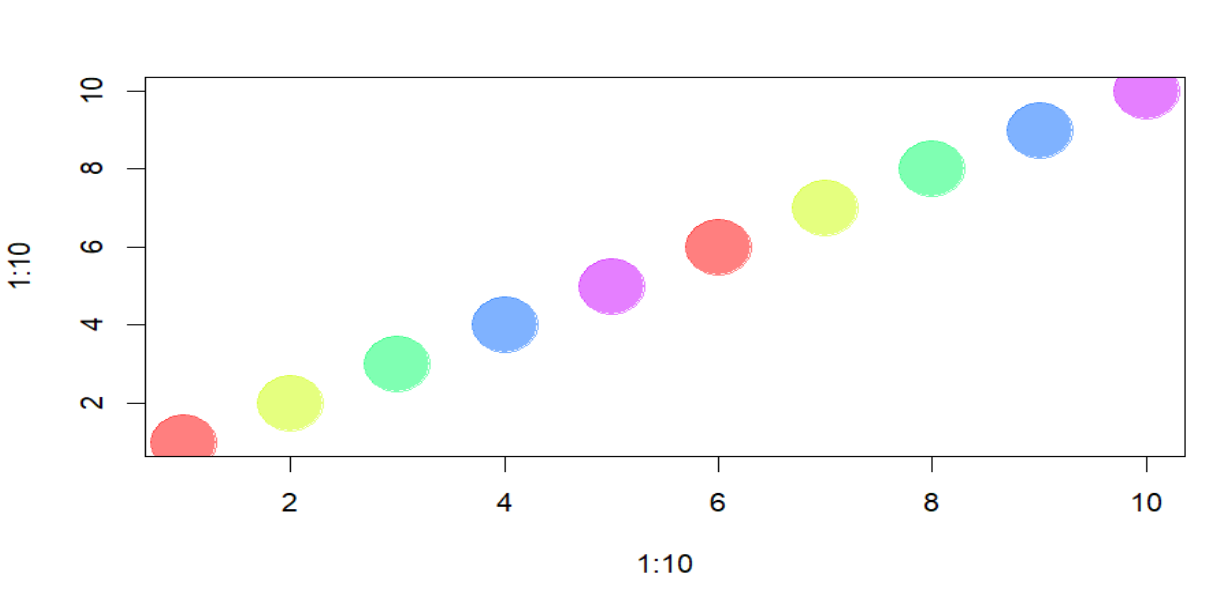
pal2 <- rainbow(5,
alpha=.5
) # 5 colors from the heat palette, transparent
plot(x=1:10,
y=1:10,
pch=19,
cex=5,
col=pal1
)
par(mfrow = c(4, 1)
) # Set up the plotting area to have 3 rows and 1 column
plot(x=1:10,
y=1:10,
pch=19,
cex=5,
col=pal2
)
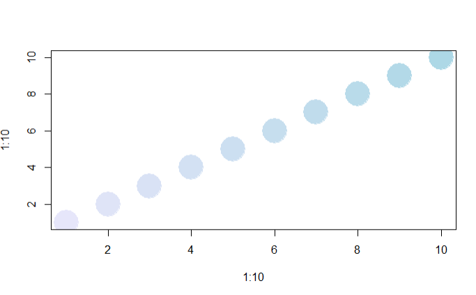
# Generate our own palette and plot
palf <- colorRampPalette(c("lavender",
"lightblue")
)
plot(x=1:10,
y=1:10,
pch=19,
cex=5,
col=palf(10)
)
palf <- colorRampPalette(c(rgb(1,1,1, .2),
rgb(.8,0,0, .7)),
alpha=TRUE)
plot(x=10:1,
y=1:10,
pch=19,
cex=5,
col=palf(10)
)
library(RColorBrewer)
display.brewer.all() # shows all palettes
# use palette
pal3 <- brewer.pal(5, "Set1") # 5 colors from the Set1 palette
par(mfrow = c(1, 1)) # Reset the plotting area to default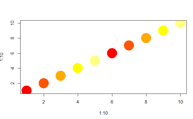
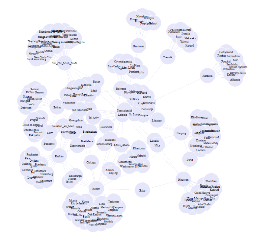
Remember the twin-city network, you created in the last Übungsblatt? We will use it again to day in order to show the different options we have in plotting.
twin_cities <- readRDS("Data/twin_cities.rds")
#show all cities in twin_cities in alphabetical order
sort(unique(unlist(twin_cities)))
tc_transform <- twin_cities |>
enframe() |>
unnest_wider("value") |>
unnest(c(cities, countries)) |>
mutate(
cities = str_replace(cities, "Addis Ababa", "Addis_Abeba"),
cities = str_replace(cities, "Frankfurt am Main", "Frankfurt_am_Main"),
cities = str_replace(cities, "Ho Chi Minh City", "Ho_Chi_Minh_Stadt"),
cities = str_replace(cities, "Kyiv", "Kyjiw"),
cities = str_replace(cities, "Nanjing", "Nanjing"),
cities = str_replace(cities, "Kraków", "Krakau")
)
d1 <- tibble(
city = c(
"Addis_Abeba",
"Birmingham",
"Bologna",
"Brünn",
"Frankfurt_am_Main",
"Hannover",
"Herzliya",
"Ho_Chi_Minh_Stadt",
"Houston",
"Krakau",
"Kyjiw",
"Lyon",
"Nanjing",
"Thessaloniki",
"Travnik"
),
country = c(
"Ethiopia",
"United Kingdom",
"Italy",
"Czech Republic",
"Germany",
"Germany",
"Israel",
"Vietnam",
"United States",
"Poland",
"Ukraine",
"France",
"China",
"Greece",
"Bosnia and Herzegovina"
)
) |>
rename(
cities = city,
countries = country
)
vertices <- tc_transform |>
select(-name) |>
rbind(d1) |>
distinct(cities, .keep_all = T)
edgelist <- tc_transform |>
select(-countries) |>
rename(
from = name,
to = cities
)
twin_cities <- graph_from_data_frame(d = edgelist,
directed = FALSE,
vertices = vertices)
twin_cities <- igraph::simplify(twin_cities,
remove.multiple = TRUE,
remove.loops = TRUE)
sp <- shortest_paths(twin_cities ,
from = "Budapest",
to = "Wuhan",
output = "vpath"
)By default, igraph plots the network like this:
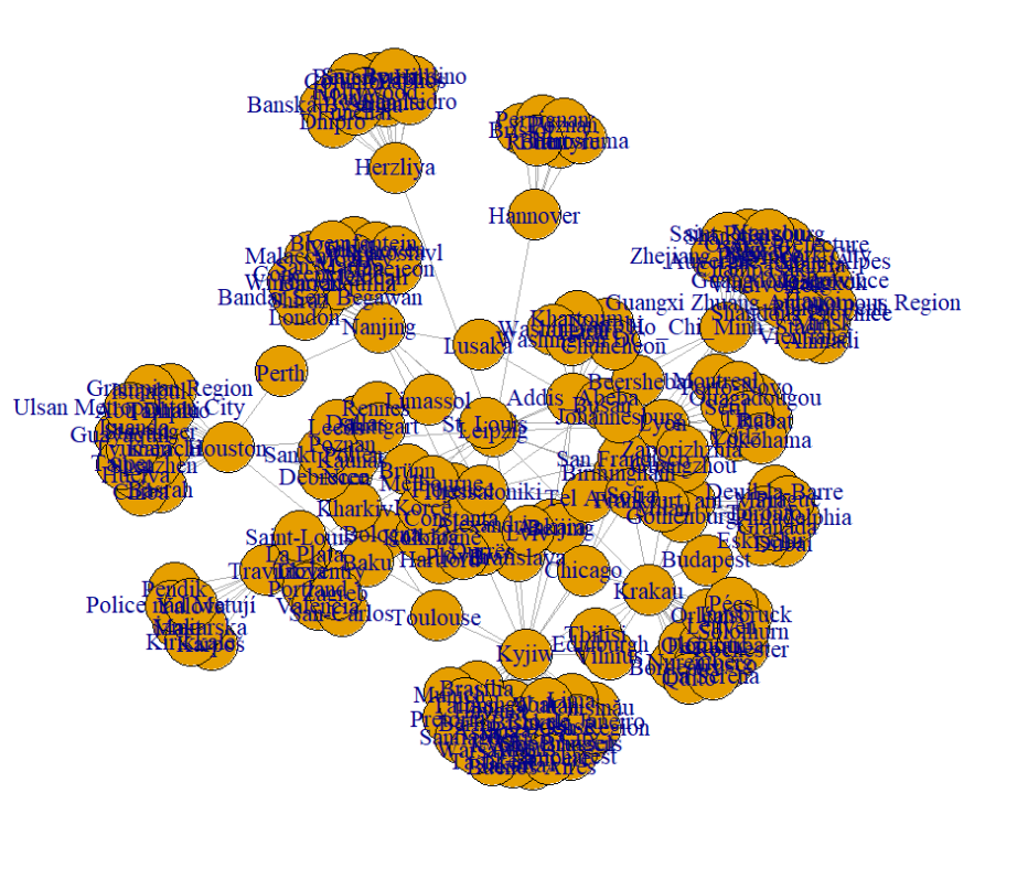
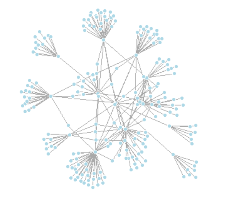
igraphAs we can clearly see, it is really difficult to identify any nodes or edges, and especially any structure within the network. But already with a few lines of code, we can improve the visualization a lot and make structural metrics more obvious.
Lets have a look at the (most important) different options:
| Parameter | Description |
|---|---|
| NODES | |
| vertex.color | Node color |
| vertex.frame.color | Node border color |
| vertex.shape | Node shape options include “none”, “circle”, “square”, “csquare”, “rectangle”, “crectangle”, “vrectangle”, “pie”, “raster”, or “sphere” |
| vertex.size | Size of the node (default is 15) |
| vertex.size2 | Second size of the node (e.g., for a rectangle) |
| vertex.label | Character vector used to label the nodes |
| vertex.label.family | Font family of the label (e.g., “Times”, “Helvetica”) |
| vertex.label.font | Font: 1 plain, 2 bold, 3 italic, 4 bold italic, 5 symbol |
| vertex.label.cex | Font size (multiplication factor, device-dependent) |
| vertex.label.dist | Distance between the label and the vertex |
| vertex.label.degree | Position of the label in relation to the vertex, where 0 is right, “pi” is left, “pi/2” is below, and “-pi/2” is above |
| EDGES | |
| edge.color | Edge color |
| edge.width | Edge width, defaults to 1 |
| edge.arrow.size | Arrow size, defaults to 1 |
| edge.arrow.width | Arrow width, defaults to 1 |
| edge.lty | Line type options: 0 or “blank”, 1 or “solid”, 2 or “dashed”, 3 or “dotted”, 4 or “dotdash”, 5 or “longdash”, 6 or “twodash” |
| edge.label | Character vector used to label edges |
| edge.label.family | Font family of the label (e.g., “Times”, “Helvetica”) |
| edge.label.font | Font: 1 plain, 2 bold, 3 italic, 4 bold italic, 5 symbol |
| edge.label.cex | Font size for edge labels |
| edge.curved | Edge curvature, range 0-1 (FALSE sets it to 0, TRUE to 0.5) |
| arrow.mode | Vector specifying arrow presence: 0 no arrow, 1 back, 2 forward, 3 both |
| OTHER | |
| margin | Empty space margins around the plot, vector with length 4 |
| frame | If TRUE, the plot will be framed |
| main | Adds a title to the plot if set |
| sub | Adds a subtitle to the plot if set |
| asp | Aspect ratio of the plot (y/x), numeric |
| palette | Color palette to use for vertex color |
| rescale | Whether to rescale coordinates to [-1,1], default is TRUE |
There are two ways to define the attributes for a plot. We can either define them directly in the plot prompt or add the information to the igraph-object directly.
# Option 1:
plot(twin_cities,
edge.arrow.size=.2,
edge.color="lavender",
vertex.color="lavender",
vertex.frame.color="#ffffff",
vertex.label.color="black",
vertex.label.cex = 0.5,
vertex.cex = 3
)
or:
tc <- twin_cities
leipzig_vertex <- which(V(tc)$name == "Leipzig") # Find the index of Leipzig
# Calculate shortest path distances from Leipzig to all other nodes
distances <- distances(tc, v = leipzig_vertex)
# Färbe die Knoten basierend auf der Entfernung von Leipzig
V(tc)$color[distances == 1] <- "lightblue" # Wenn Abstand 1, Farbe "lightblue"
V(tc)$color[distances == 2] <- "lightcyan" # Wenn Abstand 2, Farbe "lightcyan"
tc
plot(tc)
V(tc)$size <- 4
V(tc)$label <- NA
E(tc)$edge.color <- "gray80"
plot(tc)
legend(x="bottomleft",
c("dist = 1","dist = 2"),
pch=21,
col="#777777",
pt.bg=c("lightblue", "lightcyan"),
pt.cex=2,
cex=.8,
bty="n",
ncol=1)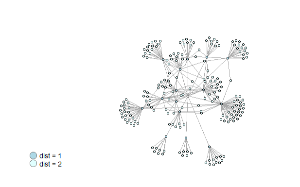
or we can only plot names (this time for a subset of nodes for visibility)
summary(V(tc)$color)
V(tc)$color[V(tc)$name == "Leipzig"] <- "lightblue"
lightblue_nodes <- V(tc)[which(V(tc)$color == "lightblue")]
V(tc)$label <- V(tc)$name
# Create the subgraph with those nodes
lightblue_subgraph <- induced_subgraph(tc, lightblue_nodes)
# called aus irgendeinem grund das falsche igraph - so gehts
lightblue_subgraph <- igraph::simplify(lightblue_subgraph,
remove.multiple = TRUE,
remove.loops = TRUE)
plot(lightblue_subgraph,
vertex.shape="none",
vertex.label=V(lightblue_subgraph)$name,
vertex.label.font=2,
vertex.label.color="gray40",
vertex.label.cex=.7,
edge.color="gray85"
)
and then again we can overwrite attributes in the plot directly.
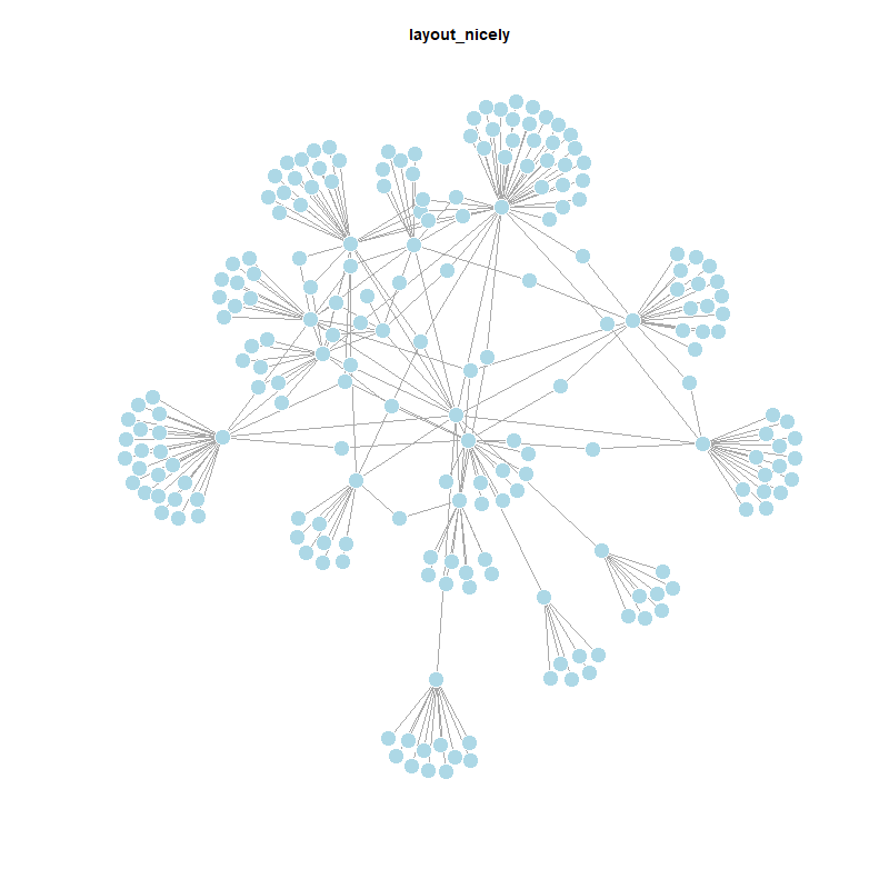
The package igraph offers a variety of layouts. Depending on the size of the network, we can already see a lot of differences in the plot by changing the layout. The default value is layout_nicely, a smart function that chooses a layouter based on the graph.
V(twin_cities)$size <- 5
V(twin_cities)$frame.color <- "white"
V(twin_cities)$color <- "lightblue"
V(twin_cities)$label <- ""
E(twin_cities)$arrow.mode <- 0
plot(twin_cities)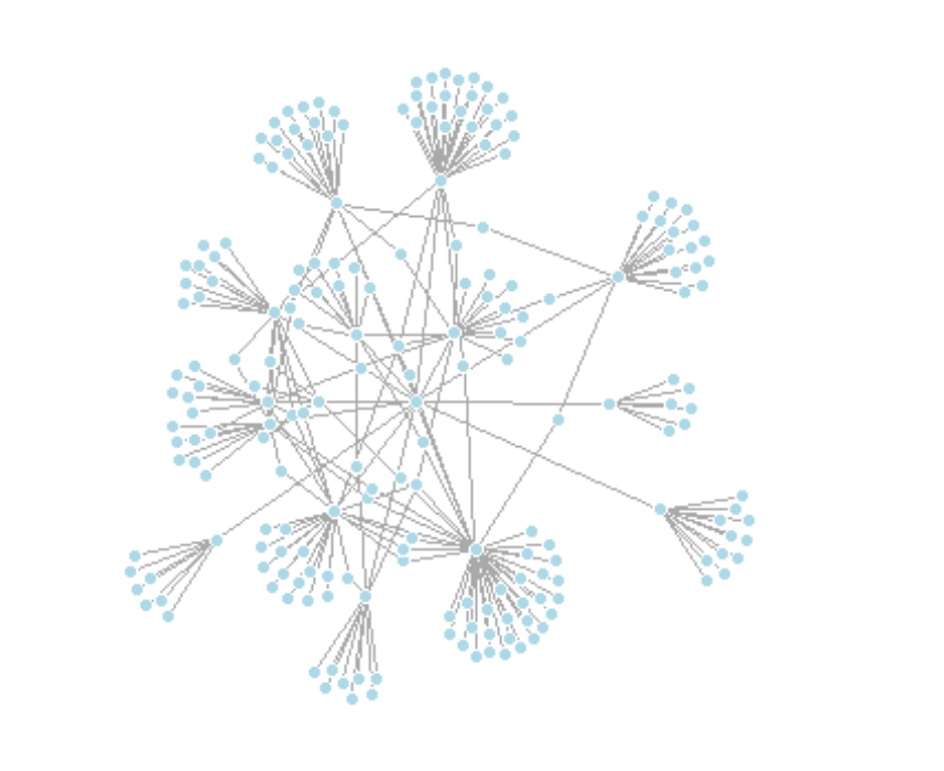
Igraph has a lot of built in layouts that are either a function or a numeric matrix, that specify how the vertices will be placed in a plot.
If it is a numeric matrix, then the matrix has to have one line for each vertex, specifying its coordinates. The matrix should have at least two columns, for the x and y coordinates, and it can also have third column, this will be the z coordinate for 3D plots and it is ignored for 2D plots.
If a two column matrix is given for the 3D plotting function rglplot then the third column is assumed to be 1 for each vertex.
plot(twin_cities,
layout = layout_in_circle)
plot(twin_cities,
layout=layout_on_sphere)If layout is a function, this function will be called with the graph as the single parameter to determine the actual coordinates. The function should return a matrix with two or three columns. For the 2D plots the third column is ignored.
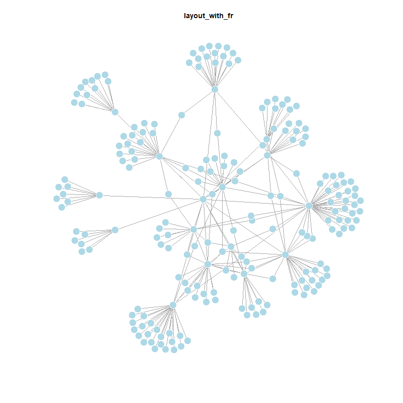
The Fruchterman-Reingold algorithm is a popular force-directed layout method. It simulates a physical system where nodes act as repelling particles and edges as attracting springs. This results in a graph where nodes are evenly distributed, with more connected nodes closer together. However, it can be slow and is typically not used for graphs larger than ~1000 vertices.
plot(twin_cities,
layout=layout_with_fr)With force-directed layouts we can use the niter parameter to control the number of iterations to perdorm. The default is set at 500.
plot(twin_cities,
layout=layout_with_fr(twin_cities,
niter=50)
)
By default, plot coordinates are rescaled to the [-1, 1] interval. To adjust this, set rescale=FALSE and manually rescale the plot using a scalar. You can also use norm_coords to normalize the plot within custom boundaries for a more compact or spread-out layout.
l <- layout_with_fr(twin_cities) # save coordinates so layout is not recalculated
# Normalize coordinates to custom boundaries
l <- norm_coords(l, ymin=-1, ymax=1, xmin=-1, xmax=1)
# Set up plot grid
par(mfrow=c(2,2), mar=c(0,0,0,0))
# Plot with varying layouts
plot(twin_cities, rescale=FALSE, layout=l*0.4)
plot(twin_cities, rescale=FALSE, layout=l*0.6)
plot(twin_cities, rescale=FALSE, layout=l*0.8)
plot(twin_cities, rescale=FALSE, layout=l*1.0)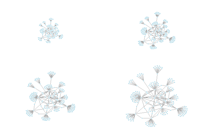
The Kamada-Kawai algorithm is another force-directed algorithm that minimizes the energy in a spring system.
plot(twin_cities,
layout=layout_with_kk)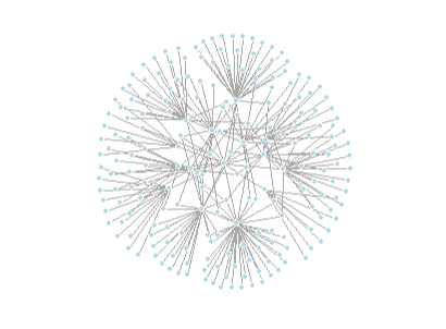
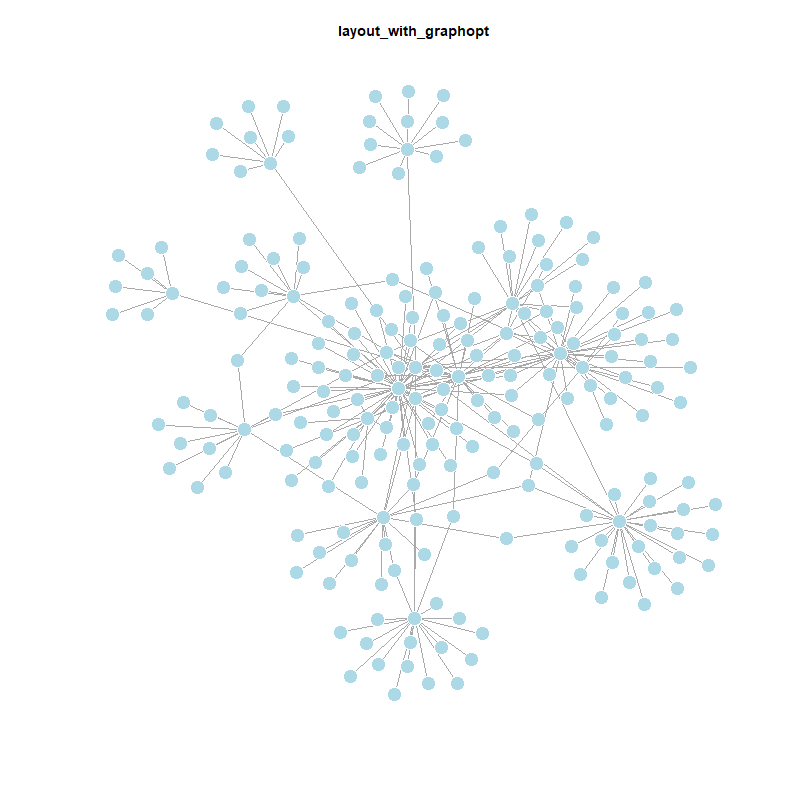
The graphopt layout algorithm allows customization of physical simulation parameters that influence the resulting graph layout. You can adjust:
charge — the electric repulsion between nodes (default: 0.001)mass — the mass of each node, affecting movement (default: 30)spring.length — the ideal edge length (default: 0)spring.constant — the stiffness of the springs (default: 1)Tweaking these parameters can produce significantly different layouts by changing how nodes repel or attract each other.
# The charge parameter below changes node repulsion:
l1 <- layout_with_graphopt(twin_cities, charge=0.02)
l2 <- layout_with_graphopt(twin_cities, charge=0.00000001)
par(mfrow=c(1,2), mar=c(1,1,1,1))
plot(twin_cities, layout=l1)
plot(twin_cities, layout=l2)
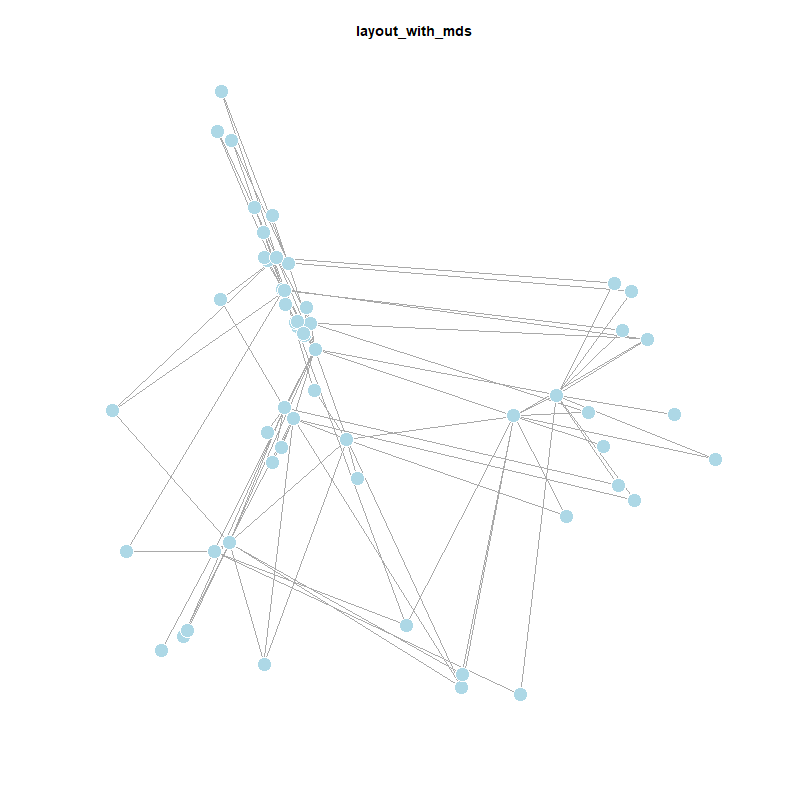
The MDS (Multidimensional Scaling) layout positions nodes based on a distance or similarity measure. By default, it uses shortest path distances, placing more similar nodes closer together. You can also supply a custom distance matrix using the dist parameter. MDS layouts are useful because node positions reflect actual distances, giving the layout a clear geometric interpretation. However, visual clarity can suffer — nodes may overlap or cluster too tightly.
plot(twin_cities,
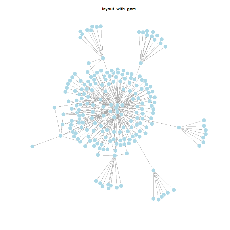
layout = layout_with_mds)So there are a lot of different ways to plot networks - highlighting different structural properties to the visual analysis (or description).
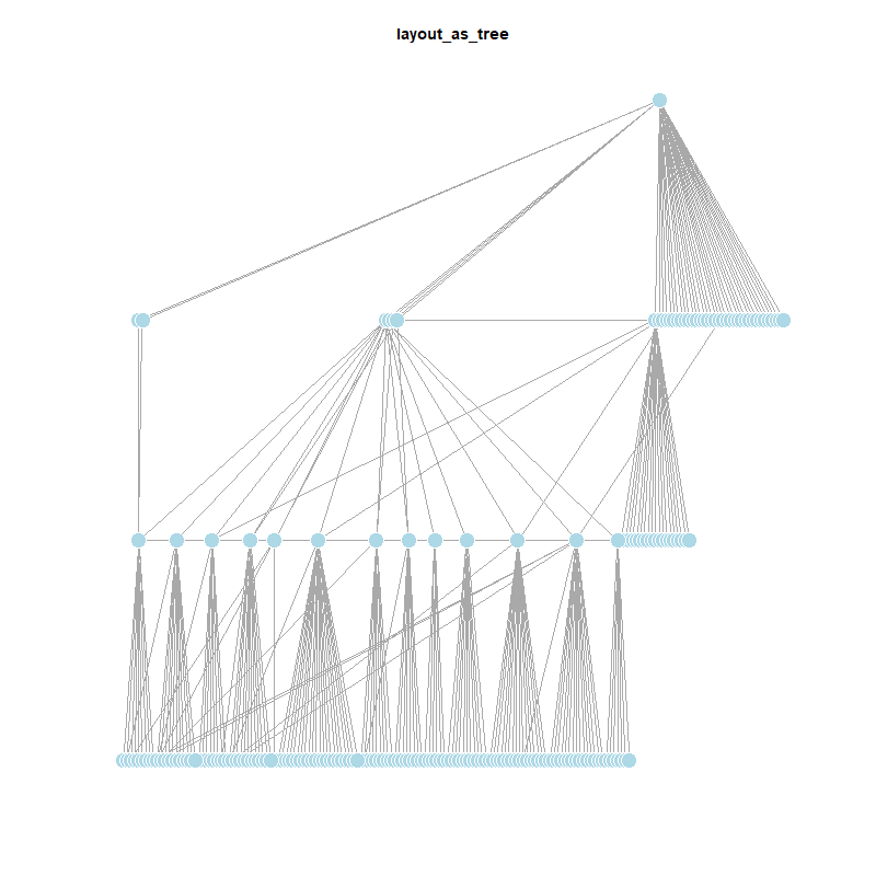
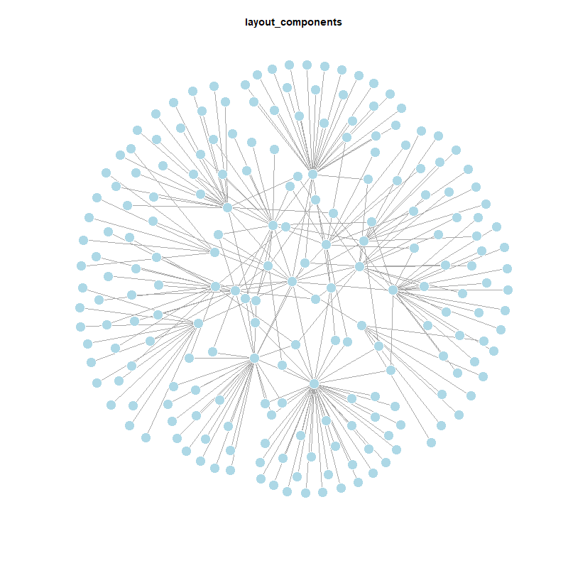
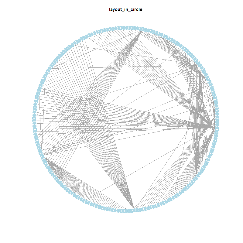
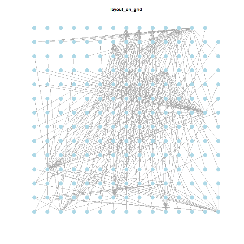
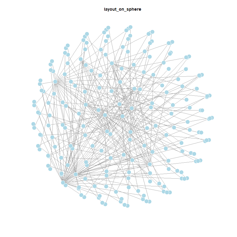
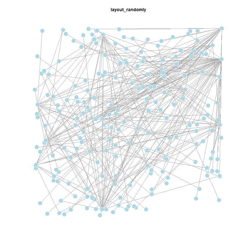
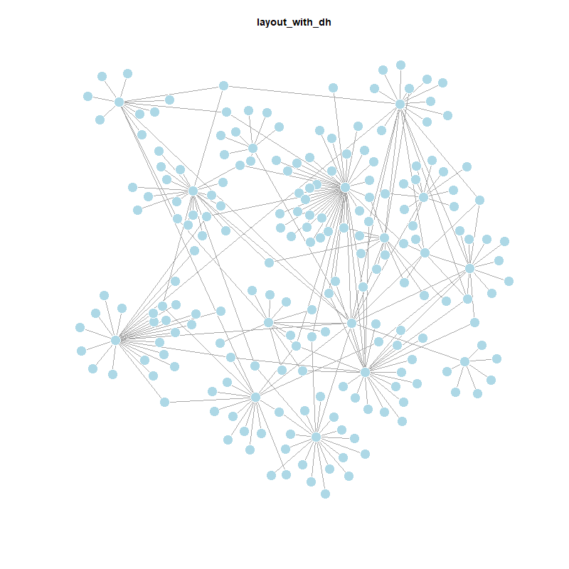
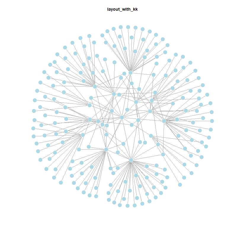
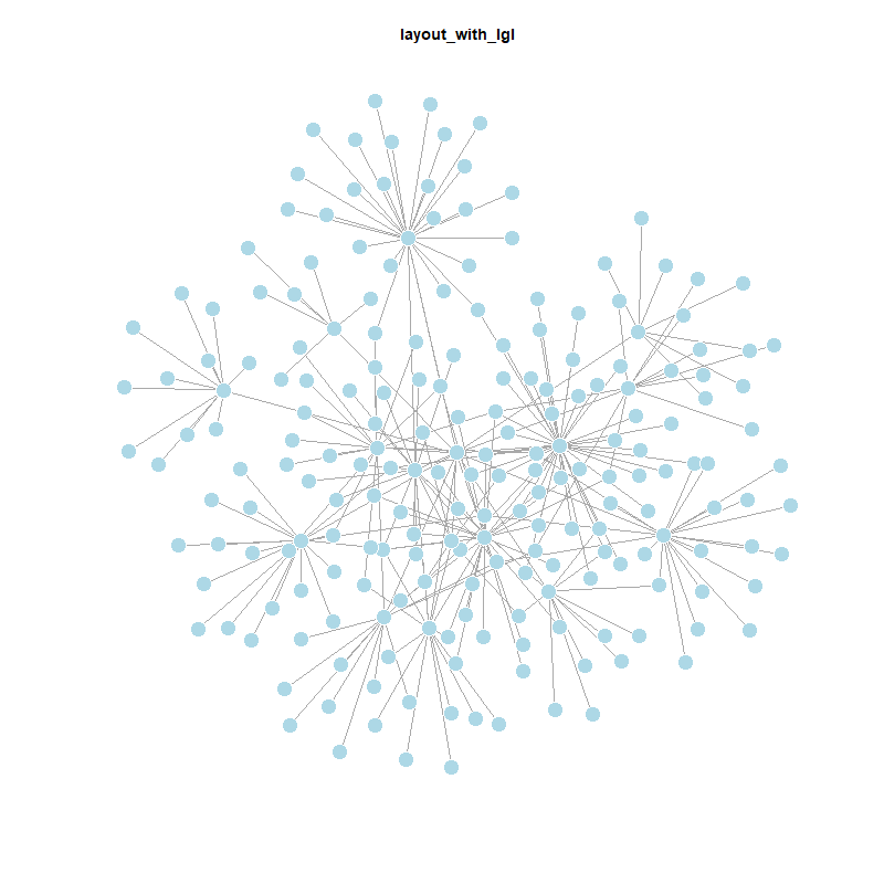
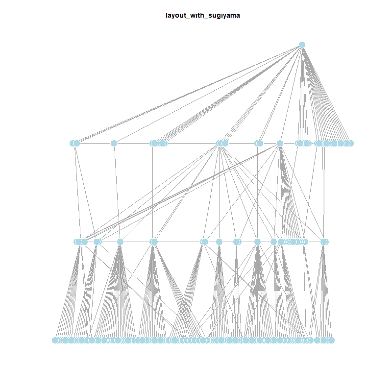
# Get all layout functions, except the first (which is usually NULL) and bipartite layouts
layouts <- grep("^layout_", ls("package:igraph"), value = TRUE)[-1]
layouts <- layouts[!grepl("bipartite", layouts)]
# Folder to save plots
dir.create("Graphics/layouts", showWarnings = FALSE)
# Plot and save each layout
for (layout in layouts) {
layout_fun <- get(layout, asNamespace("igraph"))
l <- layout_fun(twin_cities)
png(filename = paste0("Graphics/layouts/", layout, ".png"), width = 800, height = 800)
plot(twin_cities,
edge.arrow.mode = 0,
layout = l,
main = layout)
dev.off()
}
# Start Quarto block
cat("::: {layout-ncol=4}\n\n")
# Print each image markdown
for (layout in layouts) {
cat(sprintf('{group="distribution"}\n\n', layout))
}
# End Quarto block
cat(":::\n")
This plot visualizes how far each city is from Leipzig in terms of network distance. A lavender-to-blue gradient is used, where cities closer to Leipzig appear darker and those further away appear lighter. The path distance to Leipzig is added as a vertex.label.
lavender_palette <- colorRampPalette(c("#6A5ACD", "#E6E6FA")) # purple to lavender
dist.from.Leipzig <- distances(twin_cities,
v = V(twin_cities)[name == "Leipzig"],
to = V(twin_cities),
weights = NA)
col <- lavender_palette(max(dist.from.Leipzig) + 1)
col <- col[dist.from.Leipzig + 1]
plot(twin_cities,
vertex.color = col,
vertex.label = dist.from.Leipzig,
edge.arrow.size = 0.6,
vertex.label.color = "black",
vertex.label.size = 0.3)
This visualization highlights the shortest path between Leipzig and Kyoto to emphasize both the nodes and the edges involved in the path.
city_path <- shortest_paths(twin_cities,
from = V(twin_cities)[name == "Leipzig"],
to = V(twin_cities)[name == "Kyoto"],
output = "both")
ecol <- rep("gray80", ecount(twin_cities))
ecol[unlist(city_path$epath)] <- "#9370DB" # medium purple
vcol <- rep("gray40", vcount(twin_cities))
vcol[unlist(city_path$vpath)] <- "#D8BFD8" # thistle (light purple)
plot(twin_cities,
vertex.color = vcol,
edge.color = ecol,
edge.width = 0.1
)
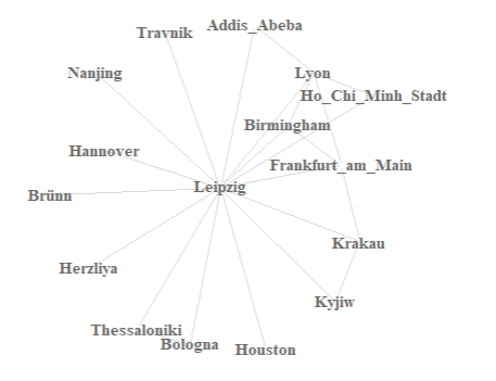
This figure highlights all edges that are directly connected to Leipzig. The city itself is shown in purple, and its incident connections are marked in blue.
inc.edges <- incident(twin_cities,
V(twin_cities)[name == "Leipzig"],
mode = "all")
ecol <- rep("gray80", ecount(twin_cities))
ecol[inc.edges] <- "#6495ED" # cornflower blue
vcol <- rep("gray40", vcount(twin_cities))
vcol[V(twin_cities)$name == "Leipzig"] <- "#BA55D3" # medium orchid
plot(twin_cities,
vertex.color = vcol,
edge.color = ecol)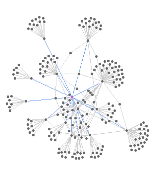
This network highlights the immediate neighbors of Leipzig—cities directly connected by an outgoing edge.
neigh.nodes <- neighbors(twin_cities,
V(twin_cities)[name == "Leipzig"],
mode = "out")
vcol <- rep("gray40", vcount(twin_cities))
vcol[neigh.nodes] <- "#87CEFA" # light sky blue
vcol[V(twin_cities)$name == "Leipzig"] <- "#BA55D3" # medium orchid
plot(twin_cities,
vertex.color = vcol)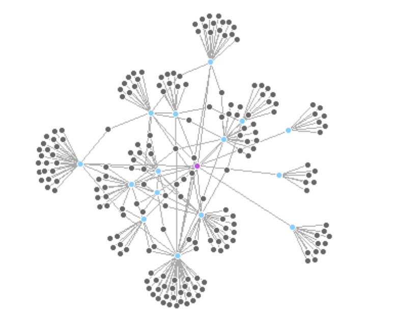
These two side-by-side plots mark groups of cities based on their country attribute (France or Japan) - this will make more sense once we dive into the community detection algorithms next week :)
# **Mark country groups (France and Japan) with lavender-blue tones**
france_nodes <- which(V(twin_cities)$countries == "France")
japan_nodes <- which(V(twin_cities)$countries == "Japan")
par(mfrow = c(1, 2))
plot(twin_cities,
mark.groups = france_nodes,
mark.col = "#E6E6FA", # lavender
mark.border = NA)
plot(twin_cities,
mark.groups = list(france_nodes, japan_nodes),
mark.col = c("#E6E6FA", "#B0C4DE"), # lavender and light steel blue
mark.border = NA)
dev.off() You get the point ;)
ggraphThe basic ggraph() plot adds edges and nodes using layers. Here we start with a default layout and basic layers. Here you can find additional information on changeable parameters.
ggraph(twin_cities) +
geom_edge_link() + # Adds straight edges
geom_node_point() # Adds simple node pointsYou can customize the layout. Here we use "gem", a force-directed layout similar to Fruchterman-Reingold, which gives a more organic structure to the network. You can use different edge and node geometries for various effects. geom_edge_fan() helps visualize overlapping edges, and you can control their appearance with color, width, and transparency.
ggraph(twin_cities, layout = "gem") +
geom_edge_fan(size = 1, color = "lightgray") +
geom_node_point(size = 4, color = "lavender") +
ggtitle("Twin Cities Network (GEM Layout)") +
theme_void()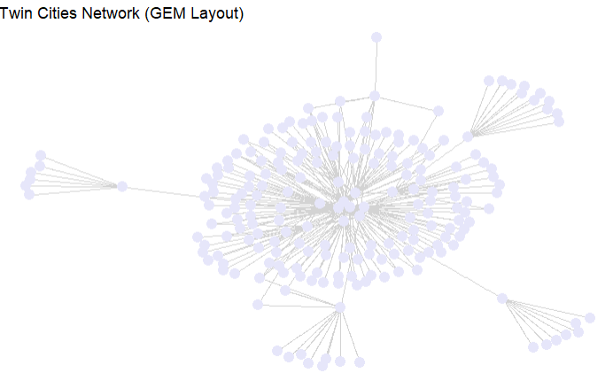
You can also use layouts like 'linear' to arrange nodes along a line, which is useful for timelines or flows. Here we use geom_edge_arc() to show curved connections.
Just like in ggplot2, you can map node or edge attributes to aesthetics using aes(). Below we color edges by a type attribute (if available) and scale node size
# Save high-resolution ggraph plot
p <- ggraph(twin_cities, layout = "linear") +
geom_edge_arc(color = "#6495ED", width = 0.6) +
geom_node_point(size = 1, color = "navy") +
geom_node_text(aes(label = name),
nudge_y = -0.6,
vjust = 1.5,
angle = 45,
size = 1,
color = "navy") +
theme_void()
# Save the plot
ggsave("Graphics/twin_cities_linear.png", plot = p,
width = 10, height = 6, dpi = 300, units = "in")
You can also label nodes using their names. Here we use geom_node_text() with repelling to avoid overlapping labels.
ggraph(twin_cities, layout = "fr") +
geom_edge_link(color = "gray80") +
geom_node_point(size = 5, color = "lavender") + # medium orchid
geom_node_text(aes(label = name), size = 3, color = "navy", repel = TRUE) +
theme_void()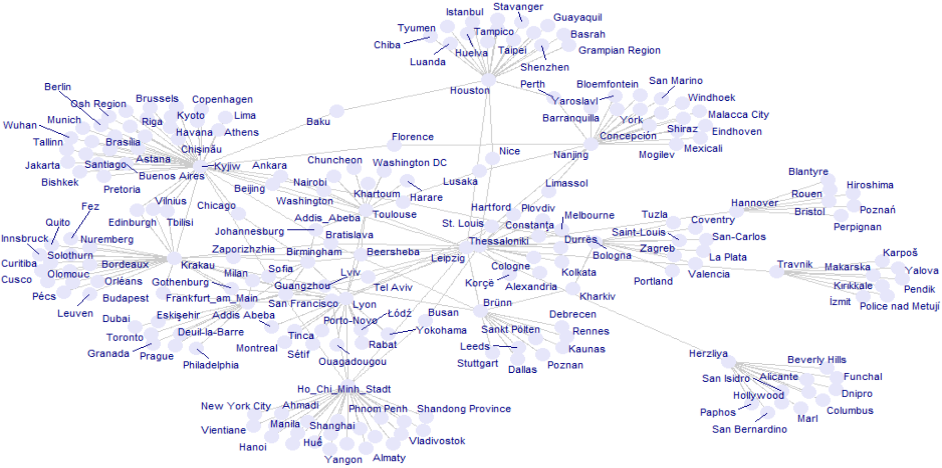
The ggraph package automatically generates legends when aesthetics like color or size are mapped to attributes. This makes interpreting your network plots easier without manual legend handling.
# Create the network plot with ggraph
network_plot <- ggraph(twin_cities, layout = "fr") +
geom_edge_link(alpha = 0.4) +
geom_node_point(aes(color = countries), size = 2) +
theme_minimal() +
labs(title = "Twin Cities Network by Country") +
theme(
legend.position = "right", # Keeps the legend on the right
plot.margin = margin(r = 150), # Adds margin space for legend
legend.text = element_text(size = 3), # Smaller text for legend
legend.title = element_text(size = 2), # Smaller legend title text
legend.key.size = unit(0.5, "cm") # Smaller legend key size (color swatches)
)
# Arrange the plot with the adjusted legend size
grid.arrange(network_plot, ncol = 1)
# Convert the twin_cities network to an adjacency matrix (without edge weights, if not available)
netm <- as_adjacency_matrix(twin_cities, sparse = FALSE)
# Set the row and column names as the city names (or node names)
colnames(netm) <- V(twin_cities)$name
rownames(netm) <- V(twin_cities)$name
# Create a color palette for the heatmap
palf <- colorRampPalette(c("lavender", "lightblue"))
# Plot the heatmap
heatmap(netm,
Rowv = NA,
Colv = NA,
col = palf(100),
scale = "none",
margins = c(10, 10),
main = "Adjacency Matrix Heatmap of Twin Cities Network")# Calculate the degree distribution of the network
deg.dist <- degree_distribution(twin_cities, cumulative = TRUE, mode = "all")
# Plot the degree distribution
plot(x = 0:max(degree(twin_cities)),
y = 1 - deg.dist,
pch = 19,
cex = 1.2,
col = "lavender",
xlab = "Degree",
ylab = "Cumulative Frequency",
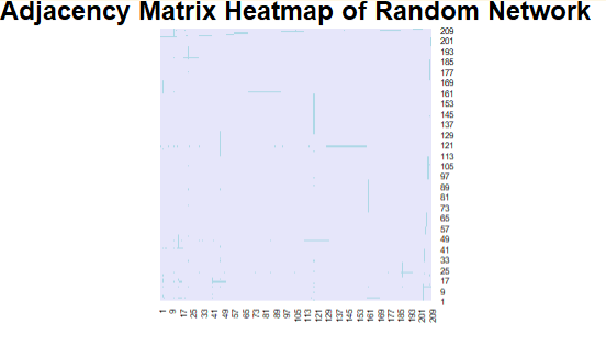
main = "Degree Distribution of Twin Cities Network")# Create a random network (Erdős–Rényi model)
set.seed(123) # For reproducibility
random_net <- erdos.renyi.game(20, p = 0.2, directed = FALSE) # 20 nodes, edge probability = 0.2
# Convert the random network to an adjacency matrix
netm <- as_adjacency_matrix(random_net, sparse = FALSE)
# Set row and column names as the node names (1, 2, ..., 20)
colnames(netm) <- V(random_net)$name
rownames(netm) <- V(random_net)$name
# Create a color palette for the heatmap
palf <- colorRampPalette(c("lavender", "lightblue"))
# Plot the heatmap of the adjacency matrix
heatmap(netm,
Rowv = NA,
Colv = NA,
col = palf(100),
scale = "none",
margins = c(10, 10),
main = "Adjacency Matrix Heatmap of Random Network")
# Calculate the degree distribution of the random network
deg.dist <- degree_distribution(random_net, cumulative = TRUE, mode = "all")
# Plot the degree distribution
plot(x = 0:max(degree(random_net)),
y = 1 - deg.dist,
pch = 19,
cex = 1.2,
col = "lavender",
xlab = "Degree",
ylab = "Cumulative Frequency",
main = "Degree Distribution of Random Network")
A lot of the times, networks are plottes as static networks at different timeframes
g <- twin_cities
start_node <- "Leipzig"
V(g)$dist <- distances(g, v = start_node)[1,]
g_t1 <- induced_subgraph(g, vids = V(g)[V(g)$name == start_node])
ggraph(g_t1, layout = "fr") +
geom_edge_link(color = "gray", alpha = 0.6) +
geom_node_point(color = "lavender", size = 6) +
geom_node_text(aes(label = name), vjust = -1, repel = TRUE, color = "darkblue") +
ggtitle("D = 0: Leipzig") +
theme_void() +
theme(plot.title = element_text(hjust = 0.5, size = 12))
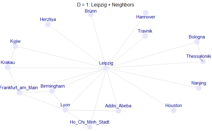
# D = 1: Leipzig + Neighbors
g_t2 <- induced_subgraph(g, vids = V(g)[V(g)$dist <= 1])
ggraph(g_t2, layout = "fr") +
geom_edge_link(color = "gray", alpha = 0.6) +
geom_node_point(color = "lavender", size = 6) +
geom_node_text(aes(label = name), vjust = -1, repel = TRUE, color = "darkblue") +
ggtitle("D = 1: Leipzig + Neighbors") +
theme_void() +
theme(plot.title = element_text(hjust = 0.5, size = 12))
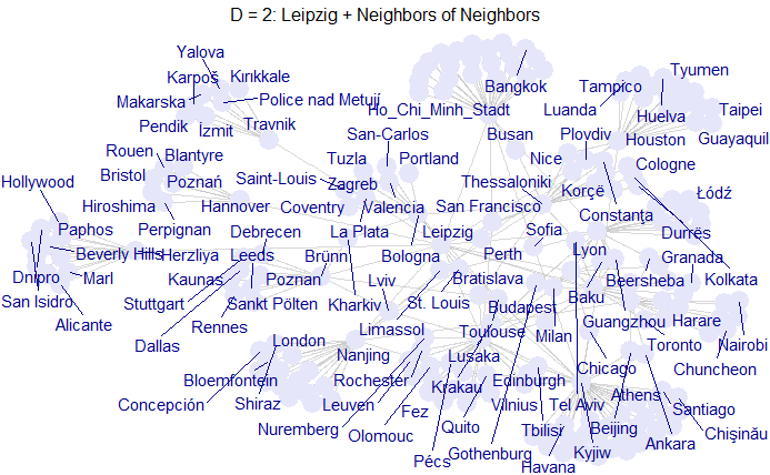
# D = 2: Leipzig + Neighbors of Neighbors
g_t3 <- induced_subgraph(g, vids = V(g)[V(g)$dist <= 2])
ggraph(g_t3, layout = "fr") +
geom_edge_link(color = "gray", alpha = 0.6) +
geom_node_point(color = "lavender", size = 6) +
geom_node_text(aes(label = name), vjust = -1, repel = TRUE, color = "darkblue") +
ggtitle("D = 2: Leipzig + Neighbors of Neighbors") +
theme_void() +
theme(plot.title = element_text(hjust = 0.5, size = 12))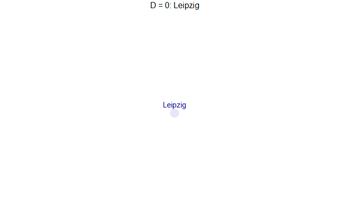
# Set the starting node (Leipzig)
start_node <- "Leipzig"
# Calculate distance from Leipzig for all nodes
distances_from_leipzig <- distances(g, v = start_node)[1,]
V(g)$distance <- distances_from_leipzig # Store the distances as a vertex attribute
# Create a list of graphs for each distance level (time)
max_dist <- max(V(g)$distance, na.rm = TRUE) # Maximum distance
# Create a list to store subgraphs at each time step
subgraphs <- lapply(0:max_dist, function(d) {
# Create a subgraph that includes nodes with distance <= d
nodes_in_time <- V(g)[V(g)$distance <= d]
induced_subgraph(g, vids = nodes_in_time)
})
# Create an animated plot using ggraph
p <- ggraph(g, layout = "fr") +
geom_edge_link(aes(alpha = 0.3), show.legend = FALSE) +
geom_node_point(aes(color = distance), size = 5) +
geom_node_text(aes(label = name), vjust = -1) +
transition_states(V(g)$distance, transition_length = 1, state_length = 100) +
labs(title = "Twin City Growth from Leipzig: t = {closest_state}") +
ease_aes('cubic-in-out')
anim <- animate(
p,
nframes = (max_dist + 1) * 10,
width = 800,
height = 600,
renderer = gifski_renderer()
)
anim_save("graphics/twin_city_growth.gif", anim)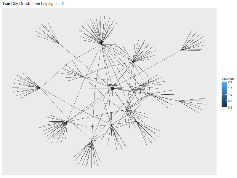
or we can just create a shiny-App with a slider
library(shiny)
ui <- fluidPage(
sliderInput("t", "Time Step", min = 0, max = 2, value = 0, step = 1),
plotOutput("networkPlot")
)
server <- function(input, output, session) {
output$networkPlot <- renderPlot({
vids <- V(g)[V(g)$dist <= input$t]
g_sub <- induced_subgraph(g, vids = vids)
ggraph(g_sub, layout = "fr") +
geom_edge_link(aes(alpha = 0.3), show.legend = FALSE) +
geom_node_point(aes(color = distance), size = 5) +
geom_node_text(aes(label = name), vjust = -1) +
ggtitle(paste("Network at time =", input$t))
})
}
shinyApp(ui, server)networkD3To create an interactive network visualization with networkD3, you first need to convert your igraph network into two data frames: one for nodes and one for edges (links). The nodes should include a unique id and optionally attributes like group or size, while the links should include source and target indices starting from 0 (not 1).
Once the data is prepared, use forceNetwork() to build the visualization, specifying node and edge attributes, and finally save it as an HTML file using htmlwidgets::saveWidget(). This allows zooming, dragging, and exploring the network interactively in a browser.
# Extract links and nodes for visualization
links <- as.data.frame(get.edgelist(twin_cities))
nodes <- data.frame(
id = 1:vcount(twin_cities),
name = V(twin_cities)$name,
countries = V(twin_cities)$countries
)
# Ensure node IDs are numeric and start from 0
links.d3 <- data.frame(from = as.numeric(factor(links$V1)) - 1,
to = as.numeric(factor(links$V2)) - 1)
# Add a Nodesize column (you can use an actual attribute here, like degree, if needed)
nodes.d3 <- data.frame(idn = factor(nodes$name, levels = nodes$name), nodes)
nodes.d3$Nodesize <- rep(6, nrow(nodes.d3)) # Add a constant size for each node
# Save as a standalone HTML file
htmlwidgets::saveWidget(
forceNetwork(Links = links.d3, Nodes = nodes.d3, Source = "from", Target = "to",
NodeID = "name", Group = "countries", linkWidth = 1,
linkColour = "#afafaf", fontSize = 12, zoom = TRUE, legend = FALSE,
Nodesize = "Nodesize", opacity = 0.8, charge = -300,
width = 800, height = 600),
"Graphics/network_plot_interactive.html", selfcontained = TRUE
)The Bali-network shows the interactions inside the Jemaah Ismlamiyah terrorist group, which conducted an attack in Bali in the year of 2002 (Koschade 2007).
You can load the network like this:
#install.packages("remotes")
#remotes::install_github("DougLuke/UserNetR")
library(intergraph)
library(UserNetR)
data(Bali)
Bali <- asIgraph(Bali)
help(Bali)The network consists of 17 nodes (the terrorists) and 63 edges (their interactions). Next to the names, their roles in the group are saved as node attributes. The intensity of the interaction is saved as an edge attribute (See help(Bali)).
vertex.attributes(Bali)
V(Bali)$label <- V(Bali)$role
plot(Bali,
vertex.size = 20,
vertex.color = "lightblue",
edge.color = "lightblue")library(RColorBrewer)
my_colors <- brewer.pal(5,"Blues")
my_colors[factor(V(Bali)$role)]
E(Bali)$color <- "lightblue"
V(Bali)$color <- my_colors[factor(V(Bali)$role)]
plot(Bali,vertex.size=20)V(Bali)$shape <- "circle"
V(Bali)[role == "CT"]$shape <- "rectangle"
plot(Bali,vertex.size=20)E(Bali)$width <- E(Bali)$IC
plot(Bali, vertex.size=20)# Extract links and nodes for visualization
# Extract edge list and include weights
edges <- get.edgelist(Bali)
weights <- E(Bali)$IC
links <- data.frame(
from = edges[, 1],
to = edges[, 2],
value = weights # 'value' is the standard name used by networkD3 for link width
)
# Convert node names to zero-based indices for networkD3
links.d3 <- data.frame(
from = as.numeric(factor(links$from)) - 1,
to = as.numeric(factor(links$to)) - 1,
value = links$value
)
nodes <- data.frame(
id = 1:vcount(Bali),
name = V(Bali)$vertex.names,
role = V(Bali)$role
)
# Full role name in data.frame
nodes <- nodes %>%
mutate(role = recode(role,
"CT" = "Command Team",
"OA" = "Operational Assistant",
"BM" = "Bomb Maker",
"SB" = "Suicide Bomber",
"TL" = "Team Lima"
)
)
# Add a Nodesize column (you can use an actual attribute here, like degree, if needed)
nodes.d3 <- data.frame(idn = factor(nodes$name, levels = nodes$name), nodes)
nodes.d3$Nodesize <- rep(6, nrow(nodes.d3)) # Add a constant size for each node
forceNetwork(Links = links.d3, Nodes = nodes.d3, Source = "from", Target = "to",
NodeID = "role", Group = "role", linkWidth = (links.d3$value*3),
linkColour = "#afafaf", fontSize = 12, zoom = TRUE, legend = TRUE,
Nodesize = "Nodesize", opacity = 0.8, charge = -300,
width = 800, height = 600)A simple graph is a graph that does not contain multiple edges or loops.↩︎
Social capital
Social Capital as a concept goes back to the work of Pierre Bourdieu (1986). Its is not such a crisply defined term as it may seem. But basically, the concept boils down to the access to resources through the social network. In the most simple terms we could operationalize this as the resources possessed by the (direct) social ties of ego. We can roughly differentiate two dimensions along which major definitions of social capital can be categorized: resources vs. structure, and a focus on the individual capital vs group capital. (Lin 2001) provides a good overview of the general concept.
The structural based approach mainly dates back to (Coleman 1958) who proposed that the social capital should be operationalized as the cohesion of a network or a subgroup. He claimed that cohesion produces trust, predictability and enables cooperation. This draws on Rational Choice Theory and proposes stable, cohesive groups with visibility of each others behavior as a prevention of defection. See network cohesion measures for descriptives.
While addressing a similar problem as Coleman, Robert Putnam (Putnam 2001) claims that groups (and indirectly the individuals in them) need civic engagement. As such, this approach focuses less on the structural properties of the network and more on what people do/ bring into the network. Hence the label “resource-based approach”. A simple way to do this is to calculate average levels of, e.g., voter turnout or participation in civic organizations per group or sub-group.
The structural approach on the individual level relates mainly to the works of Mark Granovetter (1973) and Ronald Burt (1995). Granovetter’s work on the strength of weak ties and Burt’s work on structural holes are two of the most influential theories in social network analysis. Granovetter’s theory suggests that weak ties (acquaintances) can be more valuable than strong ties (close friends) in terms of information flow and access to new opportunities. Burt’s theory emphasizes the importance of being a broker or connector between different groups in a network, which can lead to greater access to resources and information.